Operations · Case Study

Thanks for Visiting

Reach out

Overview0%
0%
0%
0%
0%
0%

Parts Receiving Revamp

Operations

Overview

36 slides · 5 stages · ~19 min

The short version

The problem was never the parts. It was the screen they arrive on: receiving was cluttered and complex, it was not integrated with the purchase order that raised it, and nothing could be actioned in bulk, so a clerk repeated the same steps line by line and left the module entirely to finish anything the purchase order owned.

My solution was 5 re-defined objectives, drawn out of a service blueprint, a heuristic evaluation, support tickets and a competitor matrix, then built as 16 web receiving screens with an OCR concept alongside. The outcome answers all 3 complaints and adds what the brief had not asked for: a keyboard friendly model, receiving on the web as well as on mobile, and a supplier's invoice read rather than typed. 5 dealerships were approached for moderated testing and 3 took part. The output is not a live product. The deck ends with phase 1 still to hand over, and its 3 success metrics, live user sentiment, support tickets and TAP requests, had no number to read against them yet.

7 months
January to July 2023, brief to the end of phase 1 design
3 of 5
Dealerships approached for moderated testing that took part
16
Web receiving screens drawn, plus the OCR concept alongside

The team

  • Jay Vijayan

    Chief Executive Officer

  • Justin Hou

    Product Design Sr. Director

  • Shyamashree Banerjee

    Product Design Lead

  • Priya Singh

    Sr. Product Designer

  • Kiran Balachandran

    Product Designer II

  • Manvith U S

    Associate Product Designer

  • Deepakkrishna R

    Product Design Intern

Start

01Brief · 6 slides

~2 min

01
Title slide: the Tekion logo above Parts Receiving Revamp set large in teal and dark ink, dated January to July 2023.

02

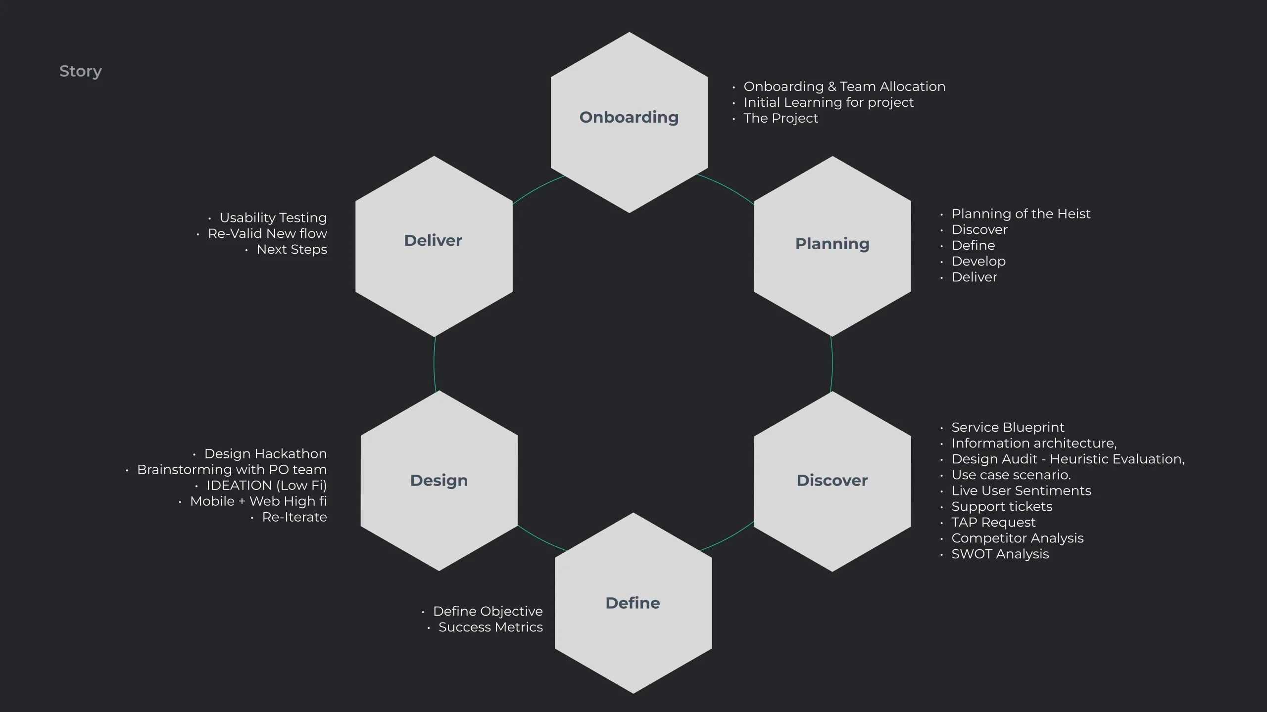
Story build, final state: the same six hexagon ring, now with a bullet list against each one. Onboarding carries team allocation and initial learning; Planning carries the double diamond phases; Discover carries the service blueprint, information architecture, heuristic evaluation, use case scenarios, live user sentiments, support tickets, TAP requests, competitor analysis and SWOT; Define carries the objectives and success metrics; Design carries the hackathon, the purchase order brainstorm, low fidelity ideation and mobile plus web high fidelity; Deliver carries usability testing, revalidating the new flow and next steps.

03

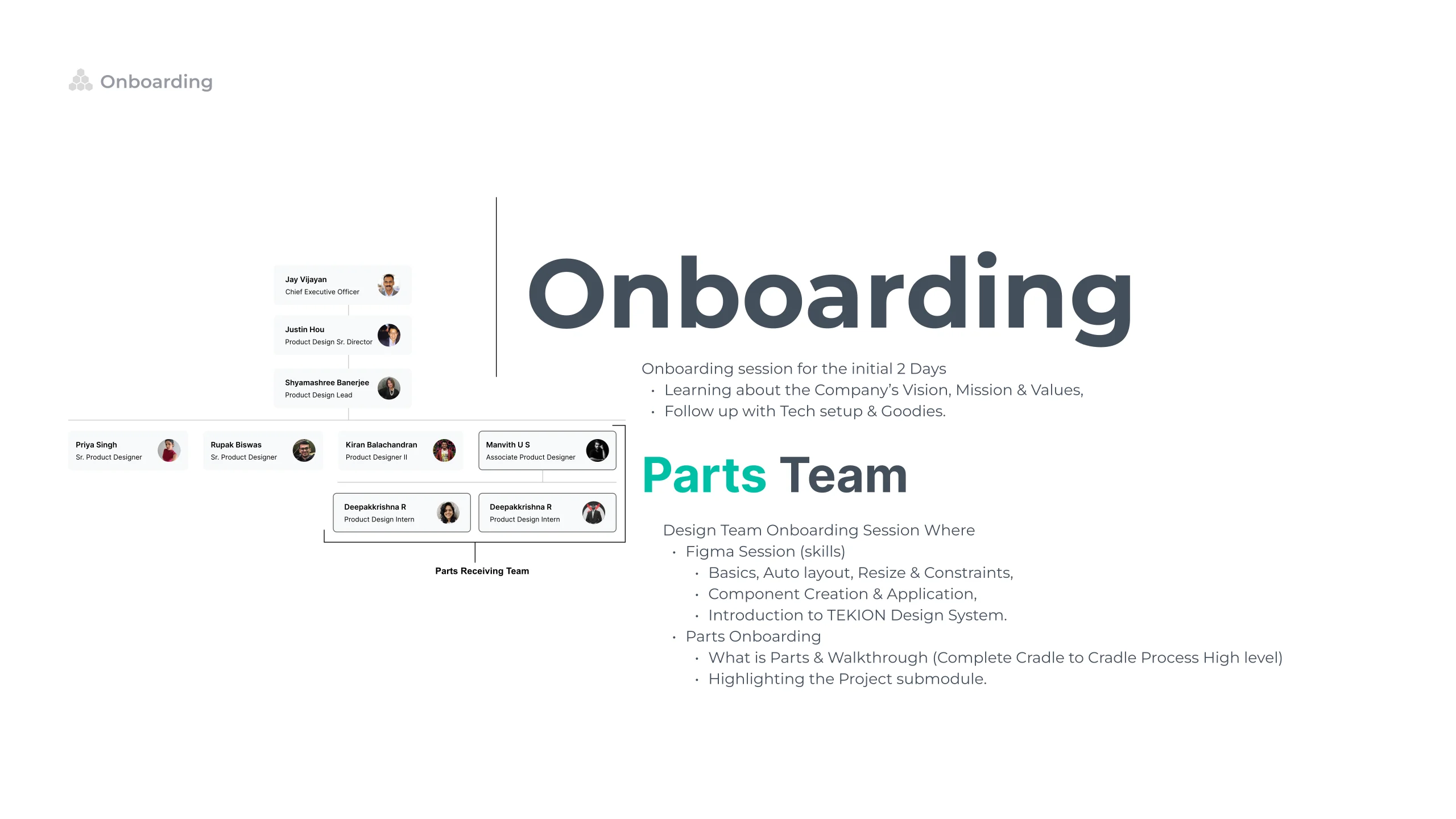
Onboarding slide: a portrait chart of the parts team and the parts receiving team, from the chief executive down to the product design intern, beside notes on the two day company induction and the design team's Figma and Tekion design system sessions.

04

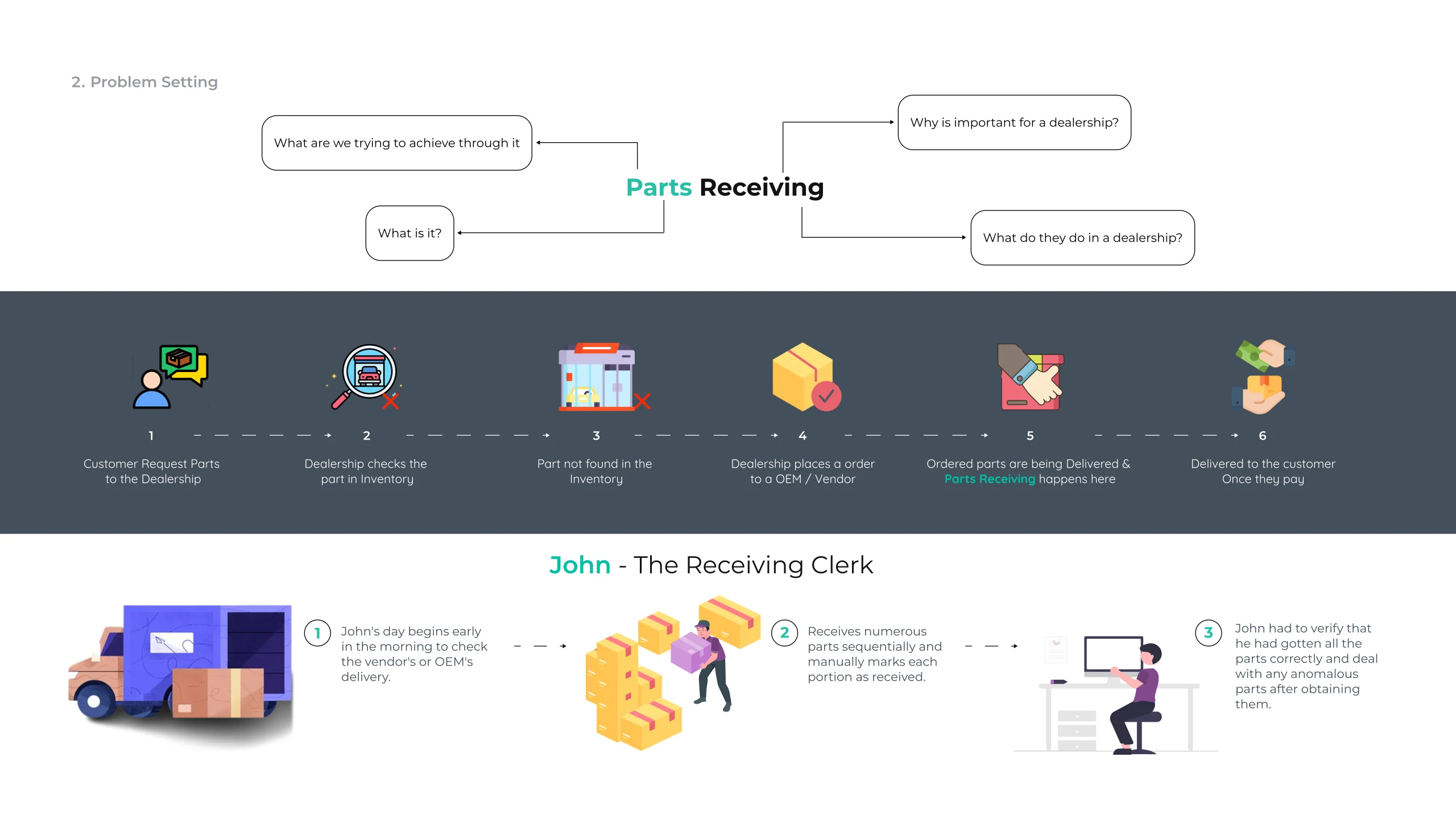
Problem setting slide: a question map around the words Parts Receiving, then a dark band of six illustrated steps running from a customer requesting a part through to delivery once they pay, and below it John the receiving clerk with three illustrated notes on his day.

05

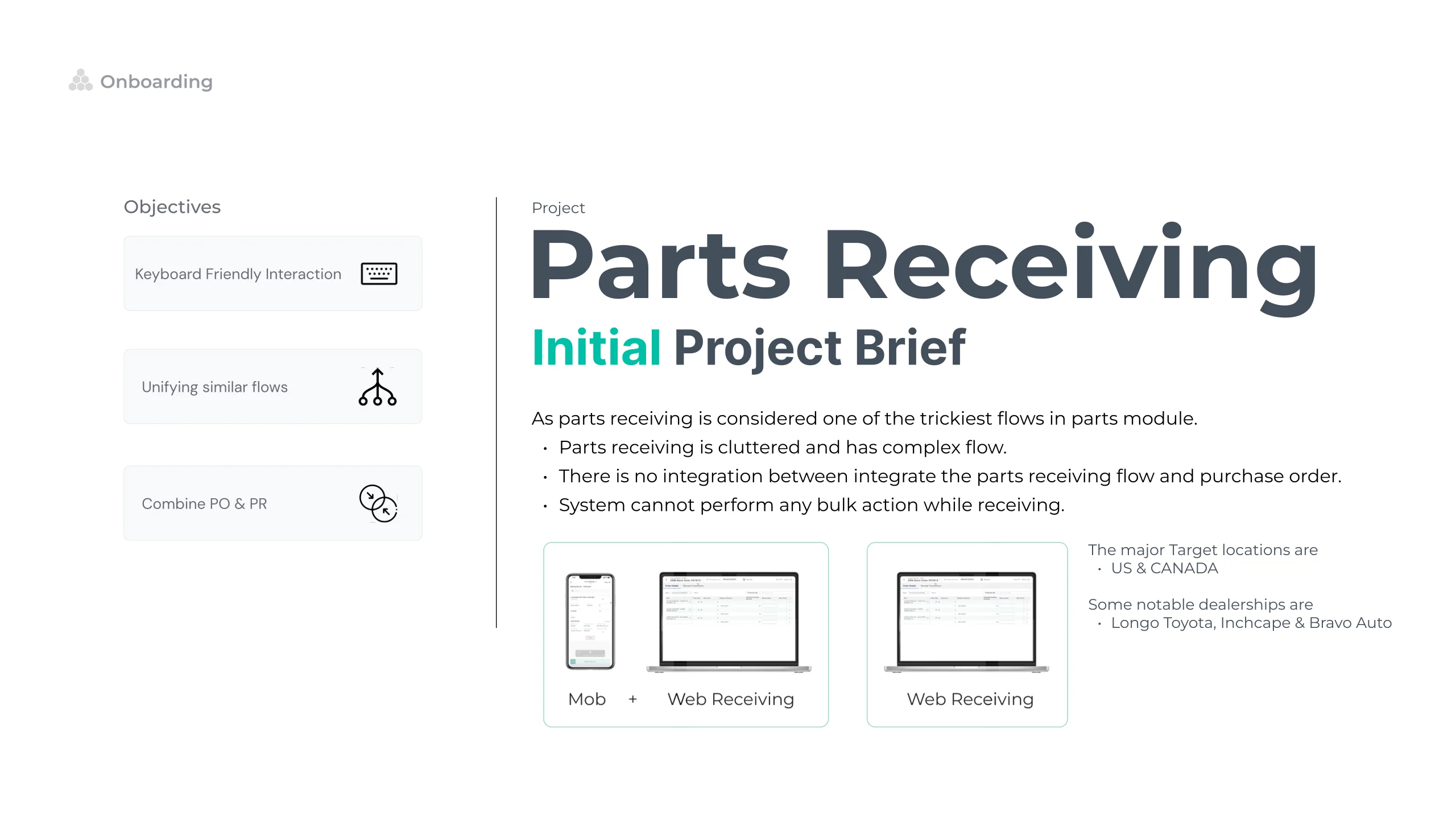
Project brief slide: parts receiving is cluttered and has a complex flow, there is no integration between receiving and the purchase order, and the system cannot perform bulk actions while receiving. The three opening objectives are stacked down the left as labelled cards, keyboard friendly interaction, unifying similar flows and combining purchase order with parts receiving, with the target markets named as the US and Canada and thumbnails of the mobile and web surfaces at the foot.

06

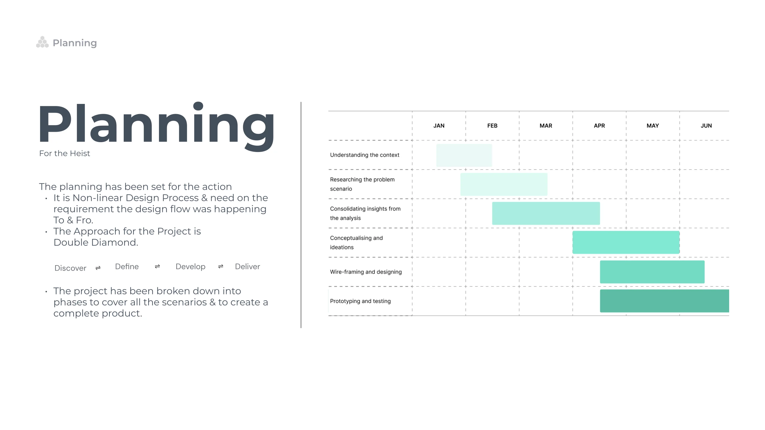
Planning slide: a non linear design process run to and fro against the requirement, using the double diamond with its four phases named Discover, Define, Develop and Deliver, beside a bar chart laying the phases across the months January to June.

Discover

02Research · 19 slides

~7 min

07
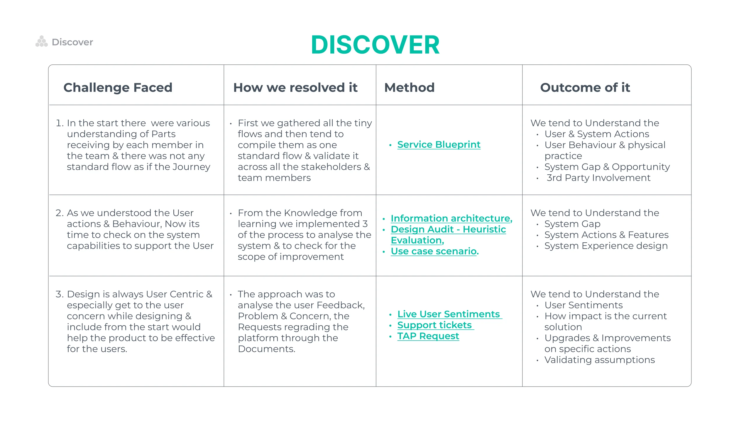
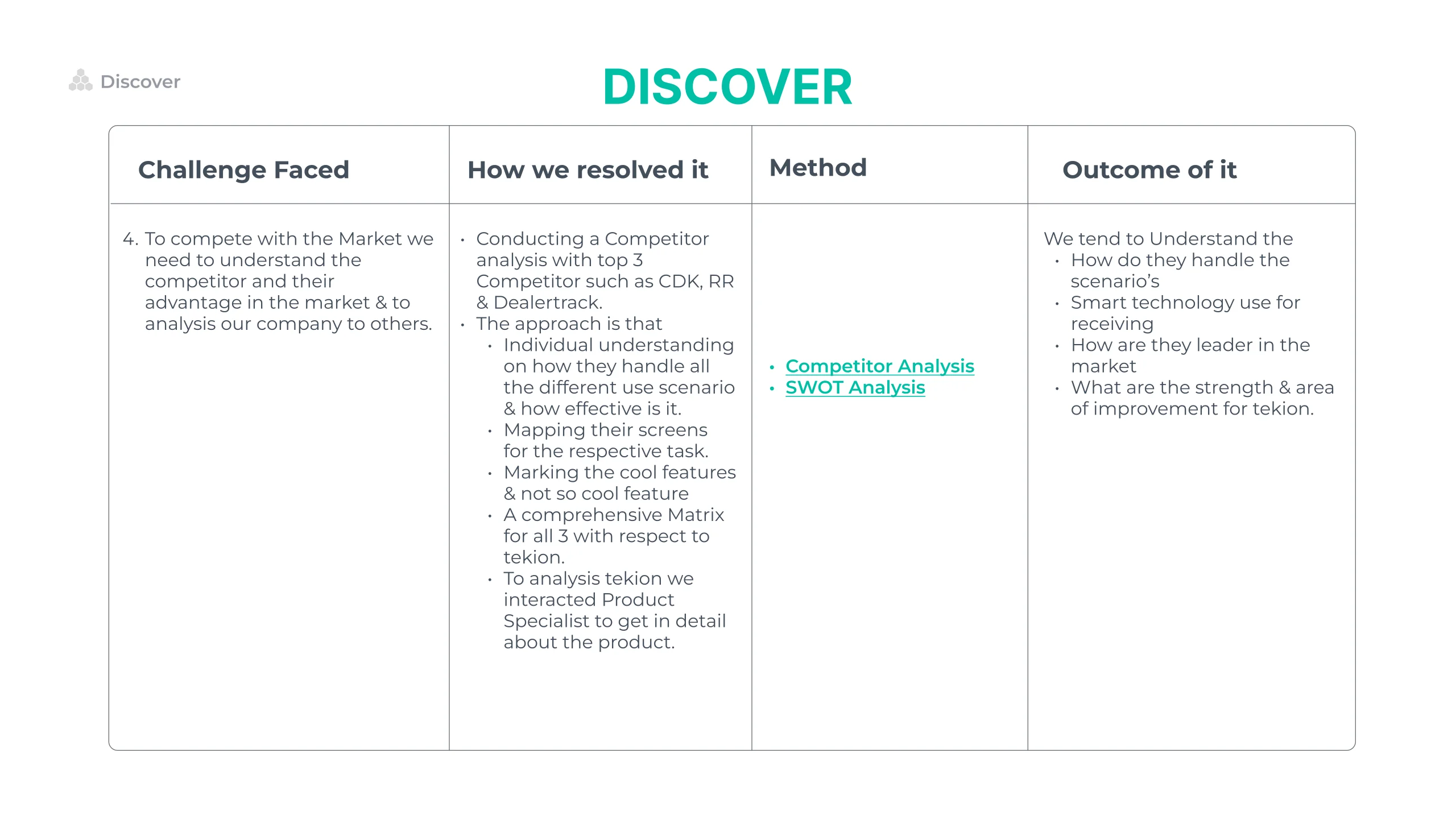
Discover slide, laid out as a four column table of challenge faced, how we resolved it, method and outcome of it. The challenges: every team member understood parts receiving differently and there was no standard flow. The methods: a service blueprint, a system study of information architecture, heuristic evaluation and use case scenarios, and a user study of live user sentiments, support tickets and TAP requests.

08

Second Discover slide in the same four column table, on competing in the market: a competitor analysis of CDK, Reynolds and Reynolds and Dealertrack, mapping their screens task by task, marking cool and not so cool features, and building a matrix against Tekion, alongside a SWOT analysis.

09

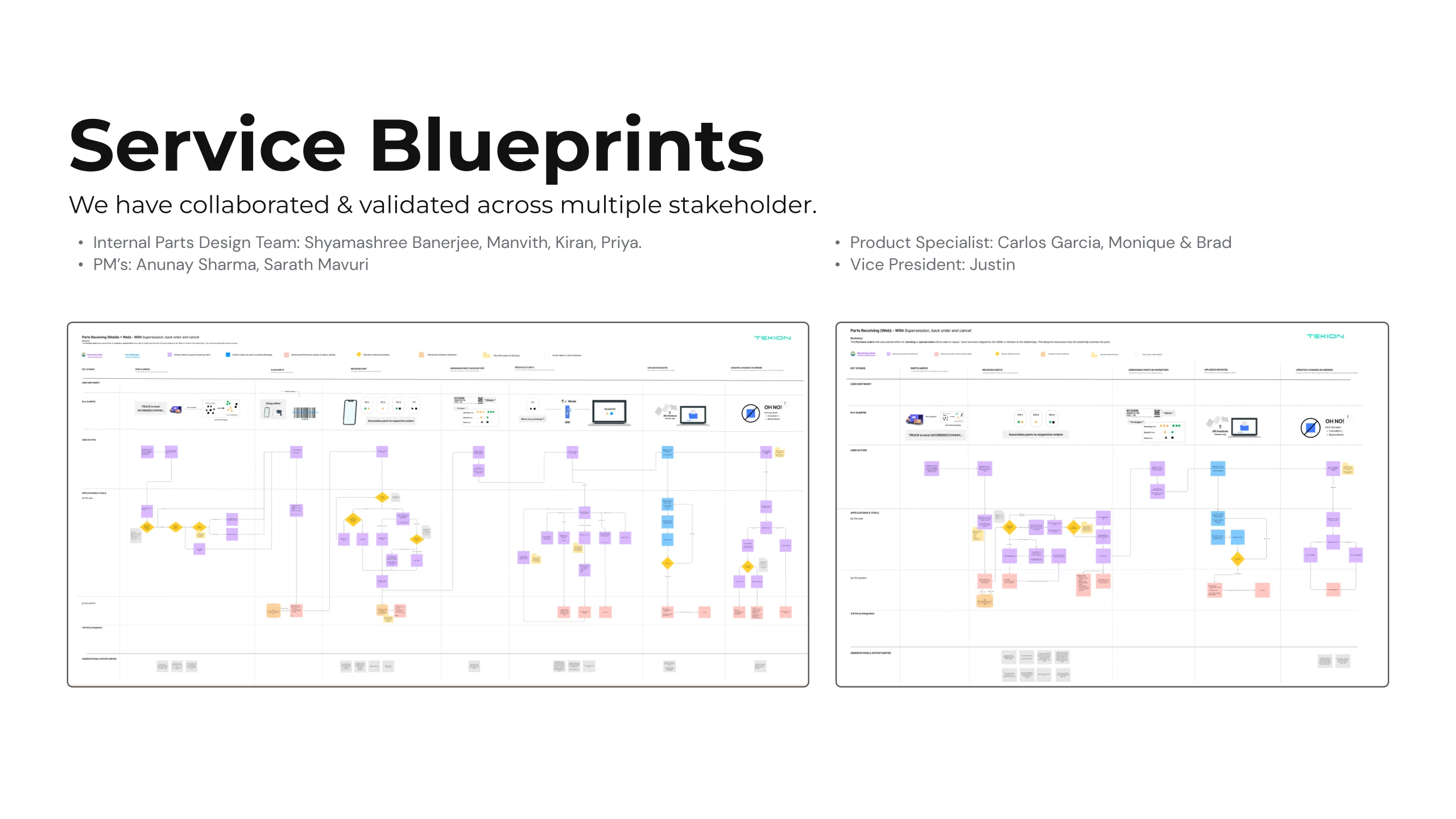
Service Blueprints slide: two wide blueprint boards mapping user actions against system actions in horizontal bands, above credits to the internal parts design team, the product managers, the product specialists and the vice president who validated it.

10

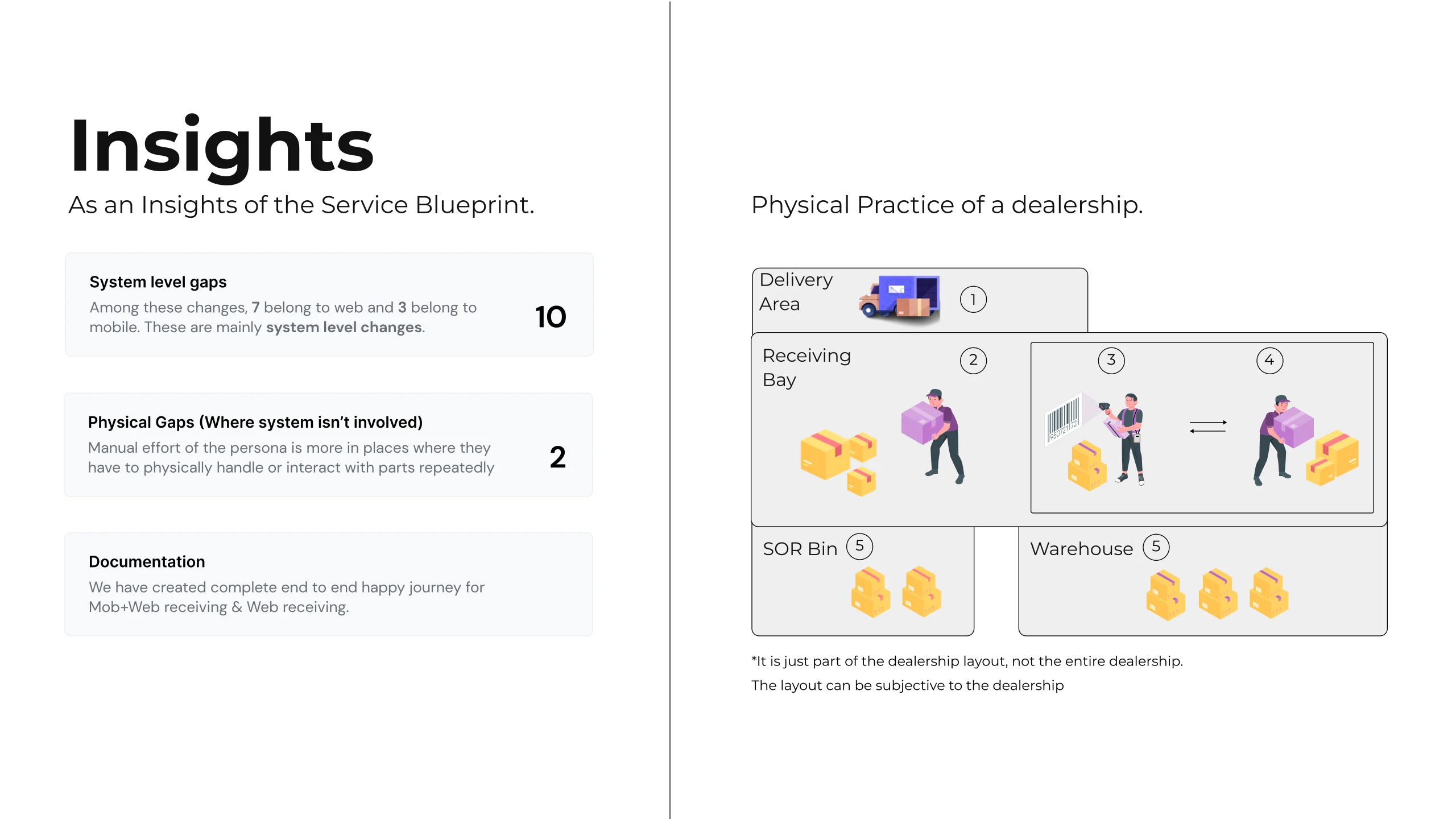
Insights from the service blueprint: three stacked cards counting ten system level gaps, seven of them web and three mobile, two physical gaps where the system is not involved at all, and the documentation produced, beside an illustrated dealership floor with the delivery area, receiving bay, special order bin and warehouse numbered.

11

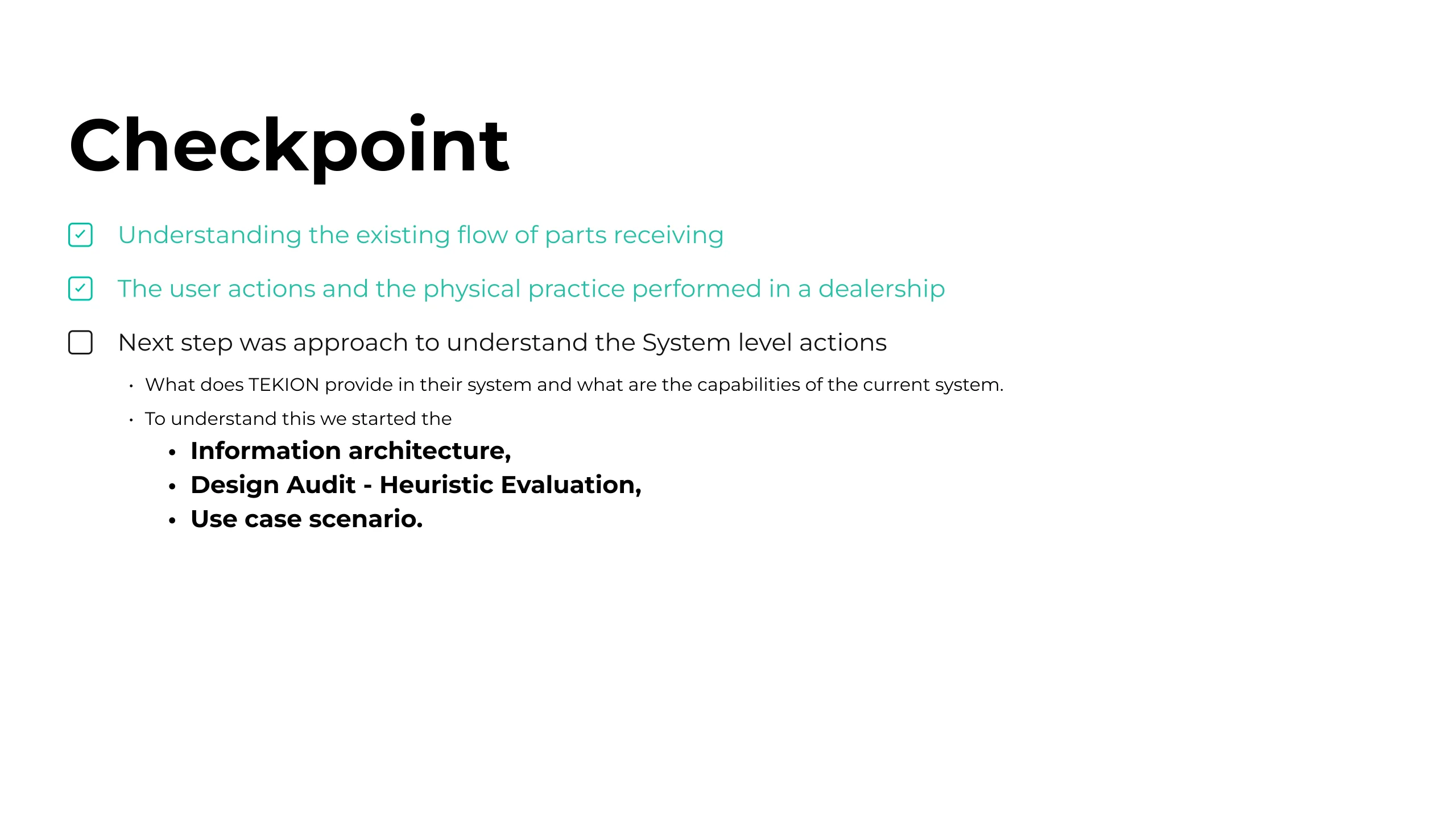
Checkpoint slide: a running checklist with the existing receiving flow and the user actions and physical practice ticked off, and the next line, the system level actions, still open, to be answered by information architecture, heuristic evaluation and use case scenarios.

12

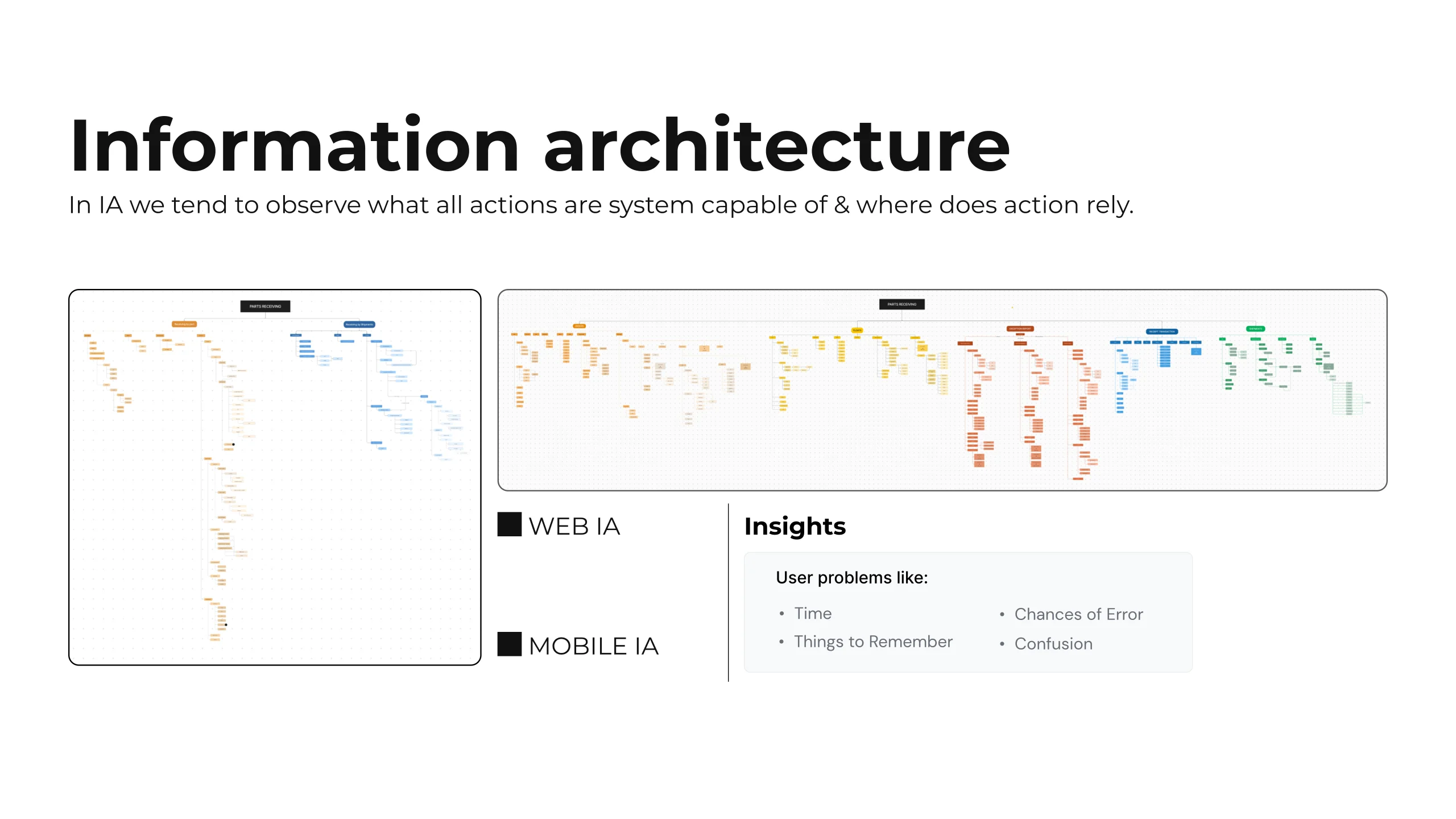
Information architecture slide: two trees, the wide web one across the top and the tall mobile one down the left, each named by a label that arrows to it, branching into the actions each surface supports, with the user cost named alongside as time, things to remember, chances of error and confusion.

13

Heuristic evaluation slide: the evaluation was run against the ten design principles and validated internally and with the product manager, mapping the TAP requests alongside. The lower two thirds of the slide is an empty bordered panel in the deck itself.

14

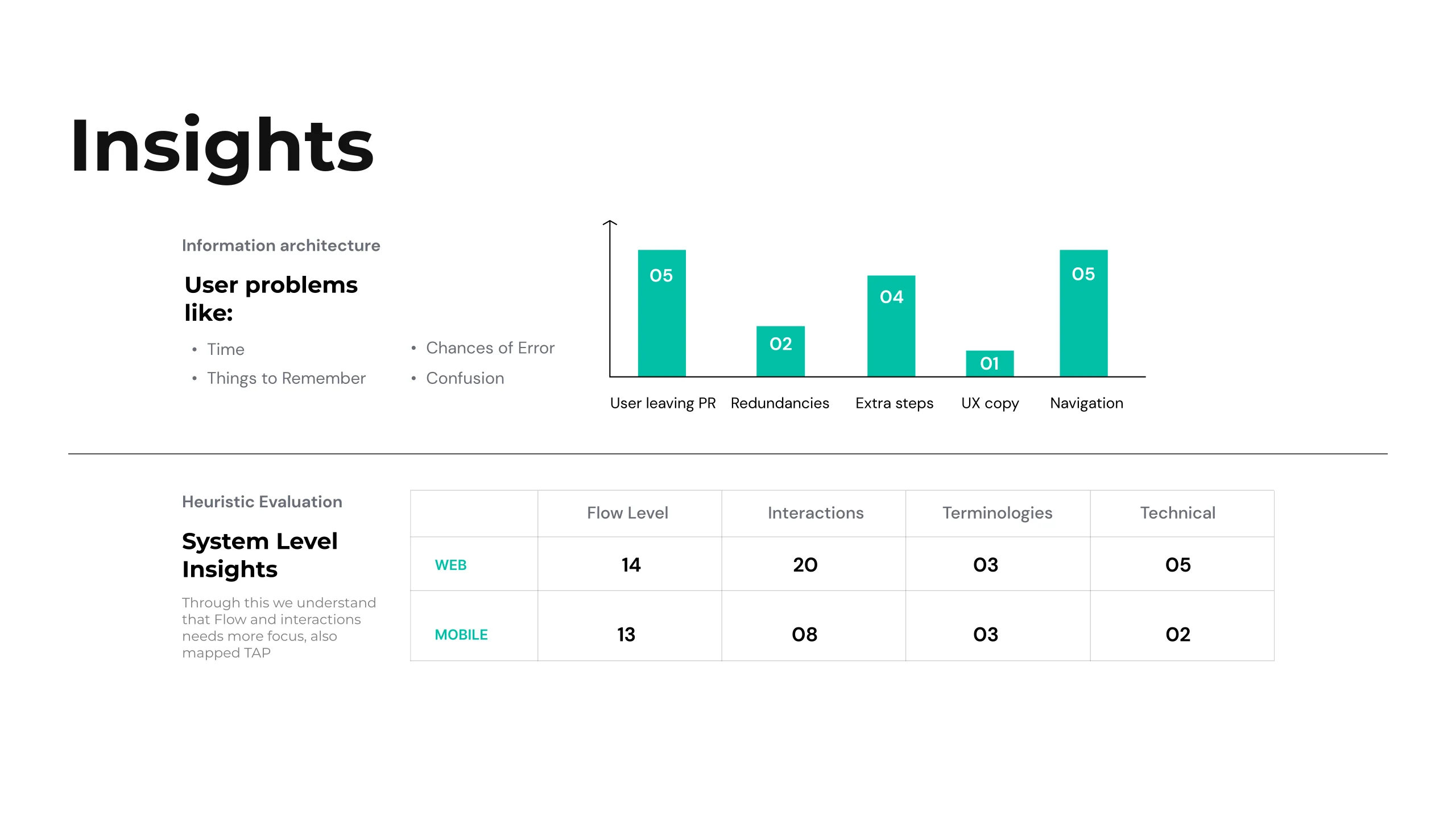
Heuristic evaluation findings: user facing problems listed at the left as time, things to remember, chances of error and confusion, a bar chart counting users leaving parts receiving, redundancies, extra steps, UX copy and navigation, and a table splitting the findings between web and mobile across flow level, interactions, terminologies and technical. The reading: flow and interactions need the most focus.

15

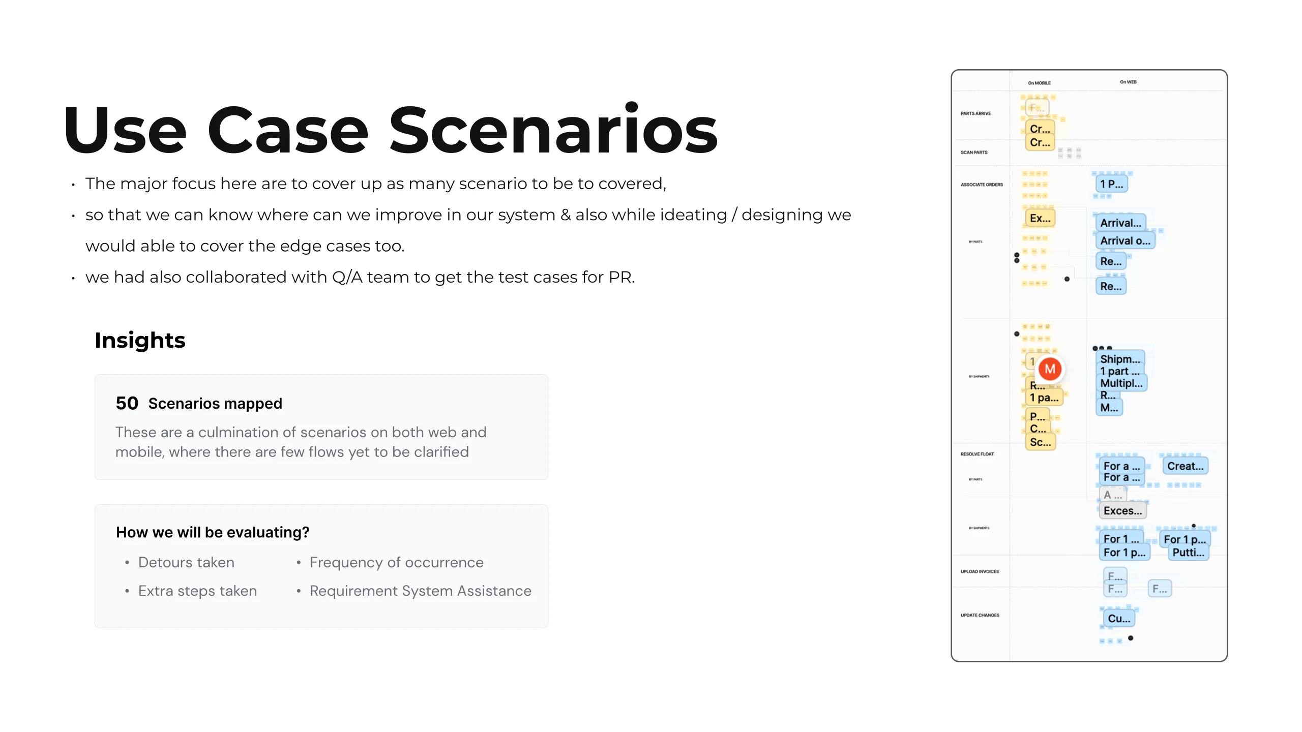
Use case scenarios slide: fifty scenarios mapped across web and mobile, built with the QA team's test cases and evaluated on detours taken, extra steps taken, how much system assistance a requirement needs, and frequency of occurrence, beside a tall board of the mapped scenarios.

16

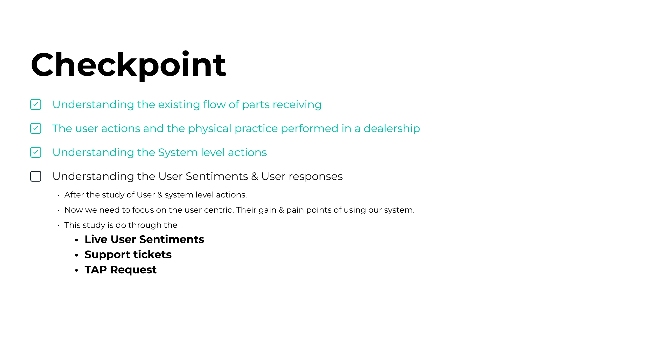
Checkpoint slide: the system level actions now ticked, and user sentiment added as the open line, to be answered by live user sentiments, support tickets and TAP requests.

17

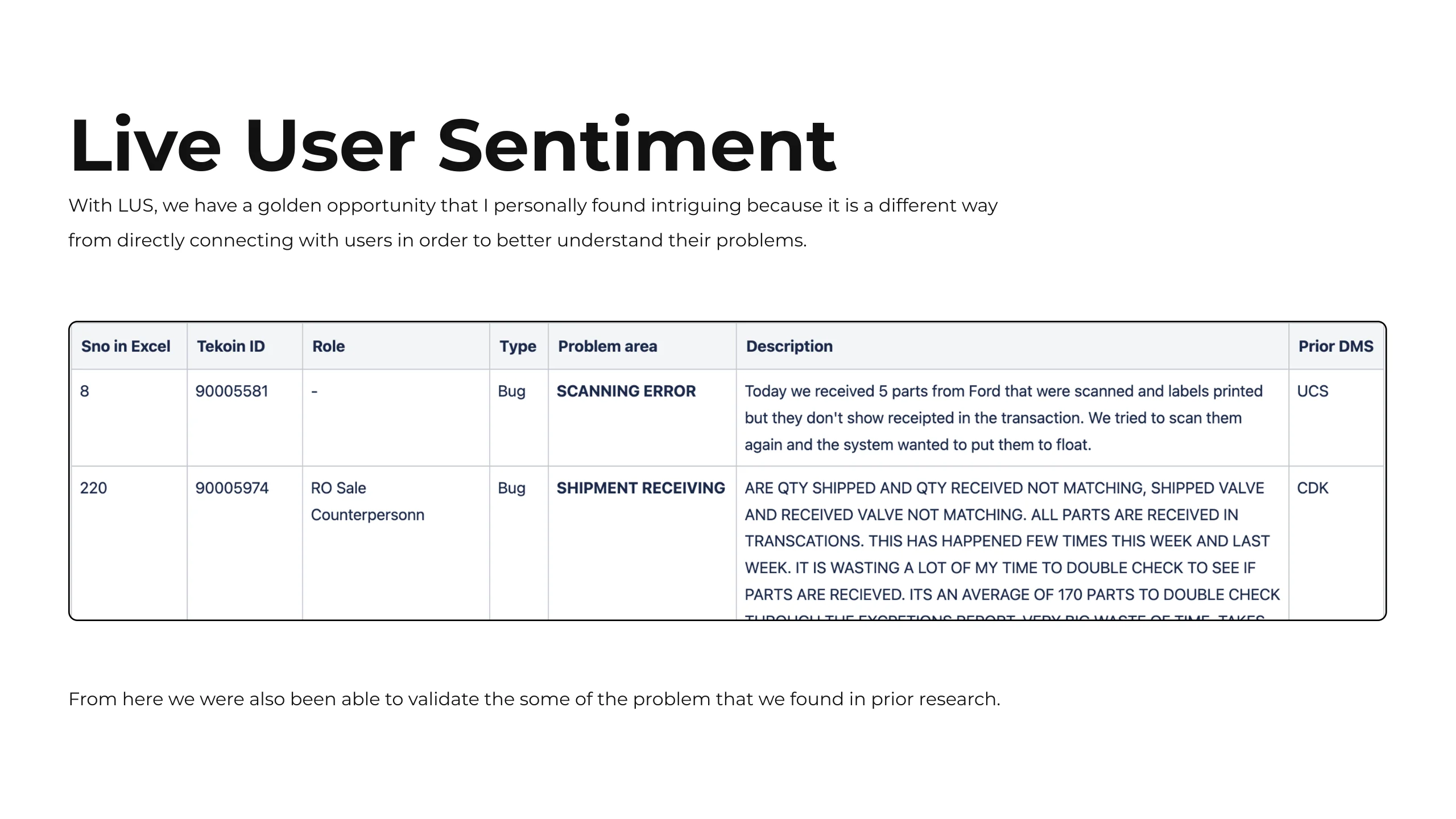
Live user sentiment slide: a way of hearing user problems without connecting with them directly, with two real logged entries shown in a table of ticket id, role, type, problem area, description and prior dealer management system, used to validate problems already found in earlier research.

18

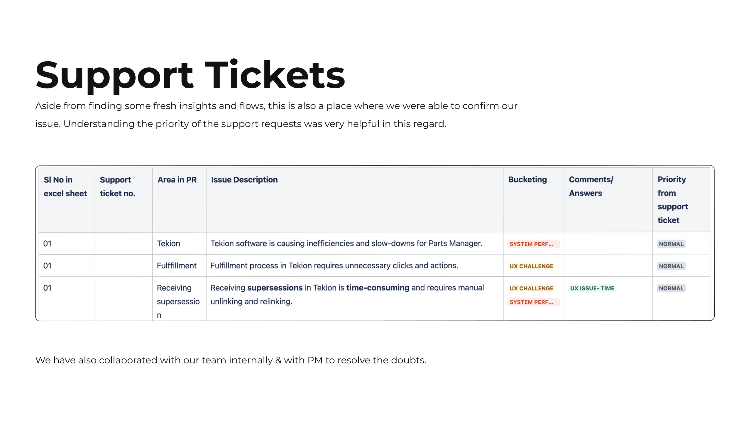
Support tickets slide: reading tickets gave fresh insights and flows, confirmation of known issues, and the priority of each request. Three sample rows are shown in a table of ticket number, area in parts receiving, issue description, bucketing, comments and priority, worked through with the team and the product manager.

19

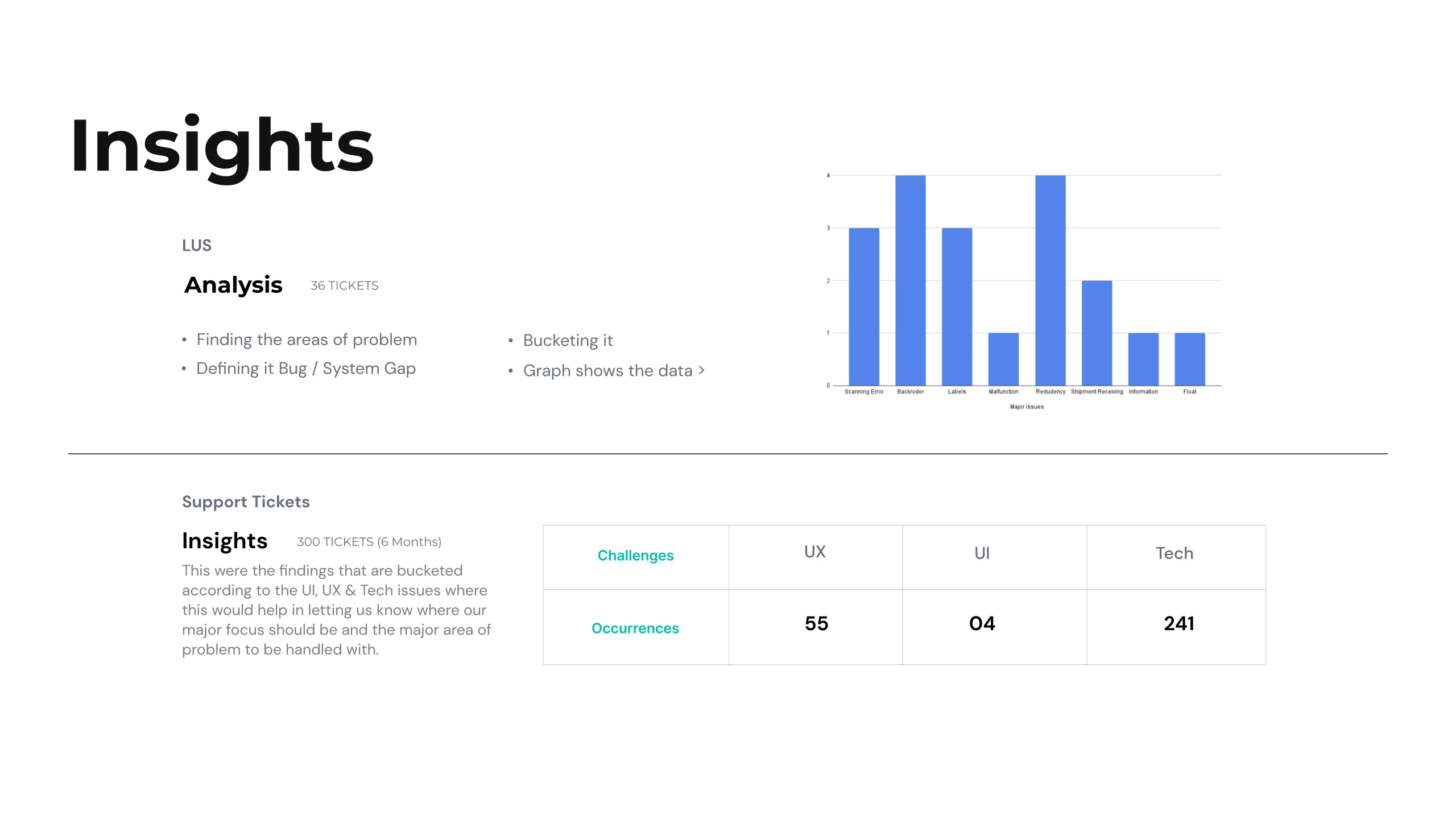
Analysis slide covering thirty six live user sentiment tickets and three hundred support tickets over six months: the method described as finding the problem area, defining it as a bug or a system gap, then bucketing it, with a bar chart of occurrences and a table counting the buckets, fifty five UX, four UI and two hundred forty one technical.

20

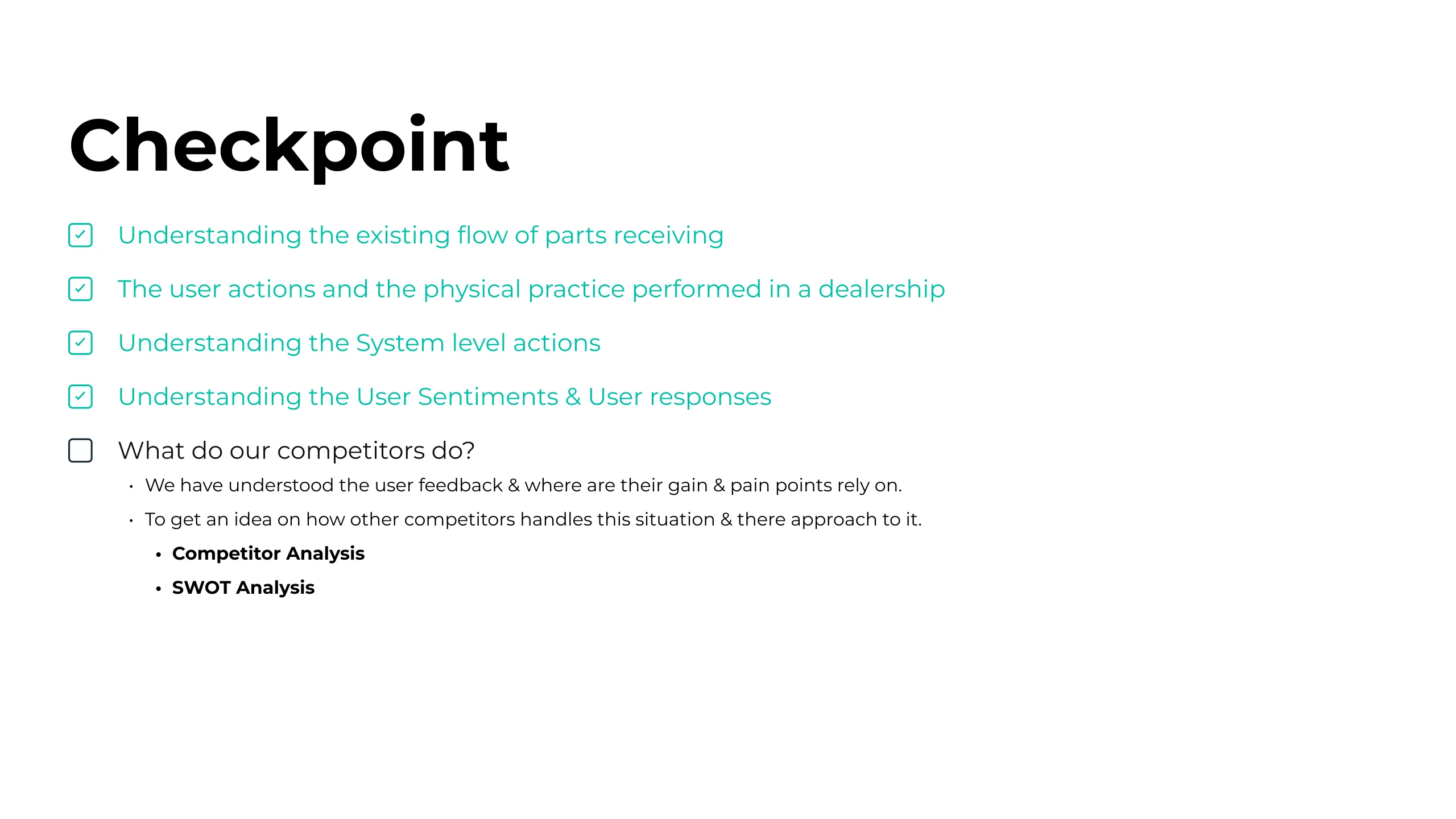
Checkpoint slide: user sentiments and responses now ticked, and the open line turned outward, what do our competitors do, to be answered by competitor analysis and SWOT analysis.

21

Competitor analysis slide naming Reynolds and Reynolds, Dealertrack and CDK as the three studied, with information gathered through interactions with users and product specialists. The rest of the slide is an empty bordered panel in the deck itself.

22

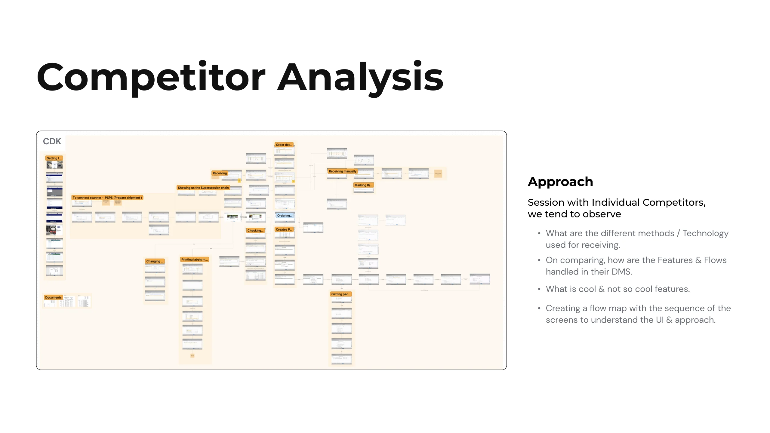
Competitor approach slide: a dense flow map of CDK's screens in sequence fills the left, beside the approach taken with each competitor, a session per competitor, noting cool and not so cool features, mapping the screen sequence to understand the interface, comparing how features and flows are handled in their dealer management system, and recording the different technologies each uses for receiving.

23

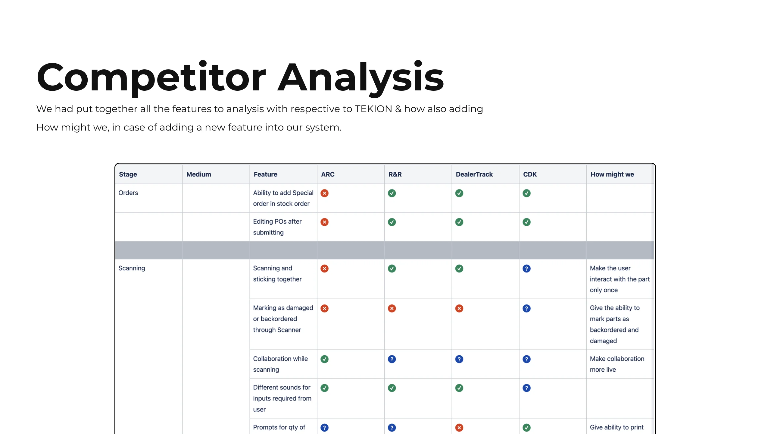
A feature comparison matrix putting Tekion against the three competitor systems row by row, marked with coloured dots for what each supports, and a how might we written against each gap where a new feature would be added.

24

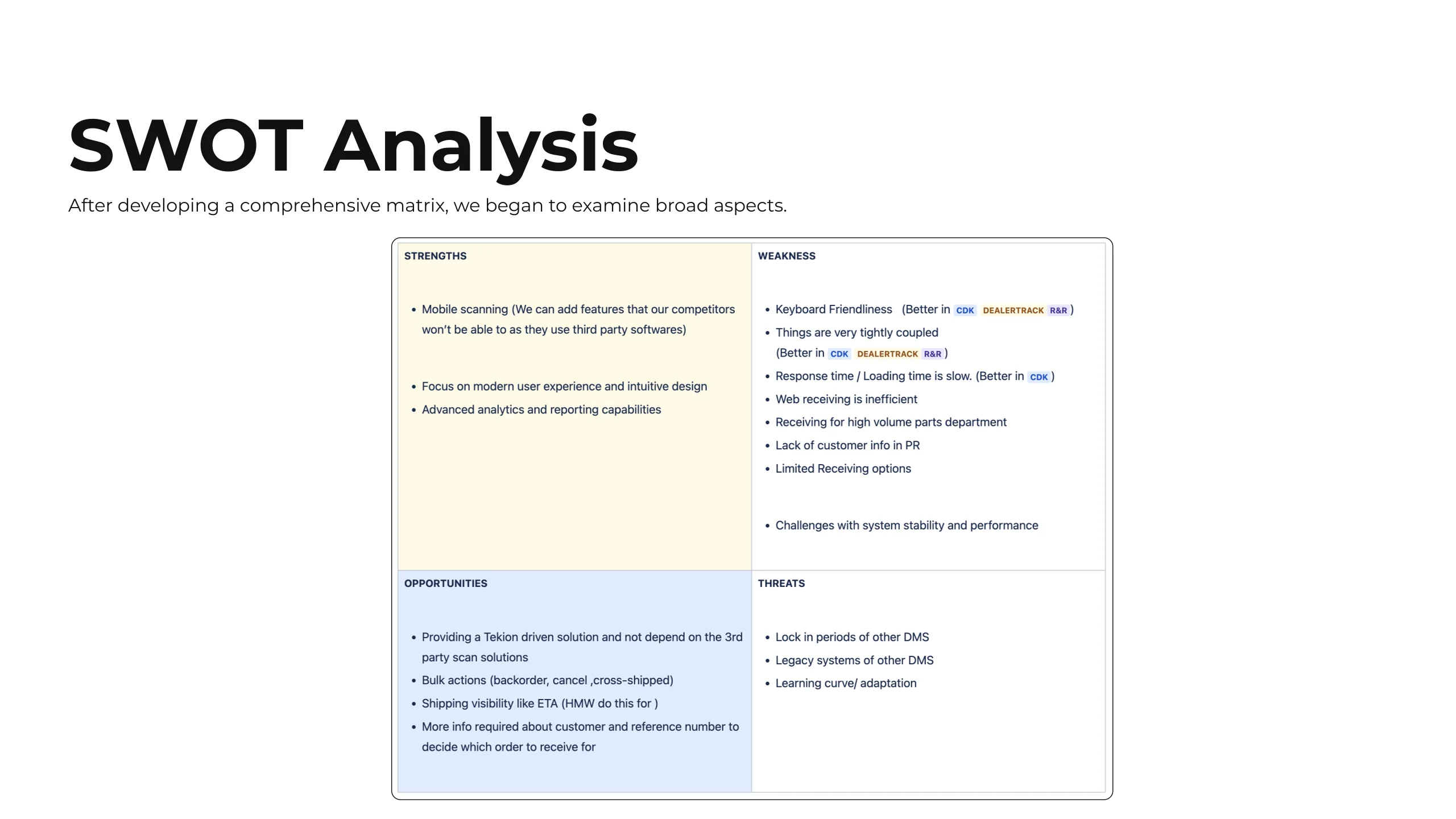
A SWOT analysis in four quadrants, strengths, weaknesses, opportunities and threats, opened out from the competitor matrix to look at the broader position.

25

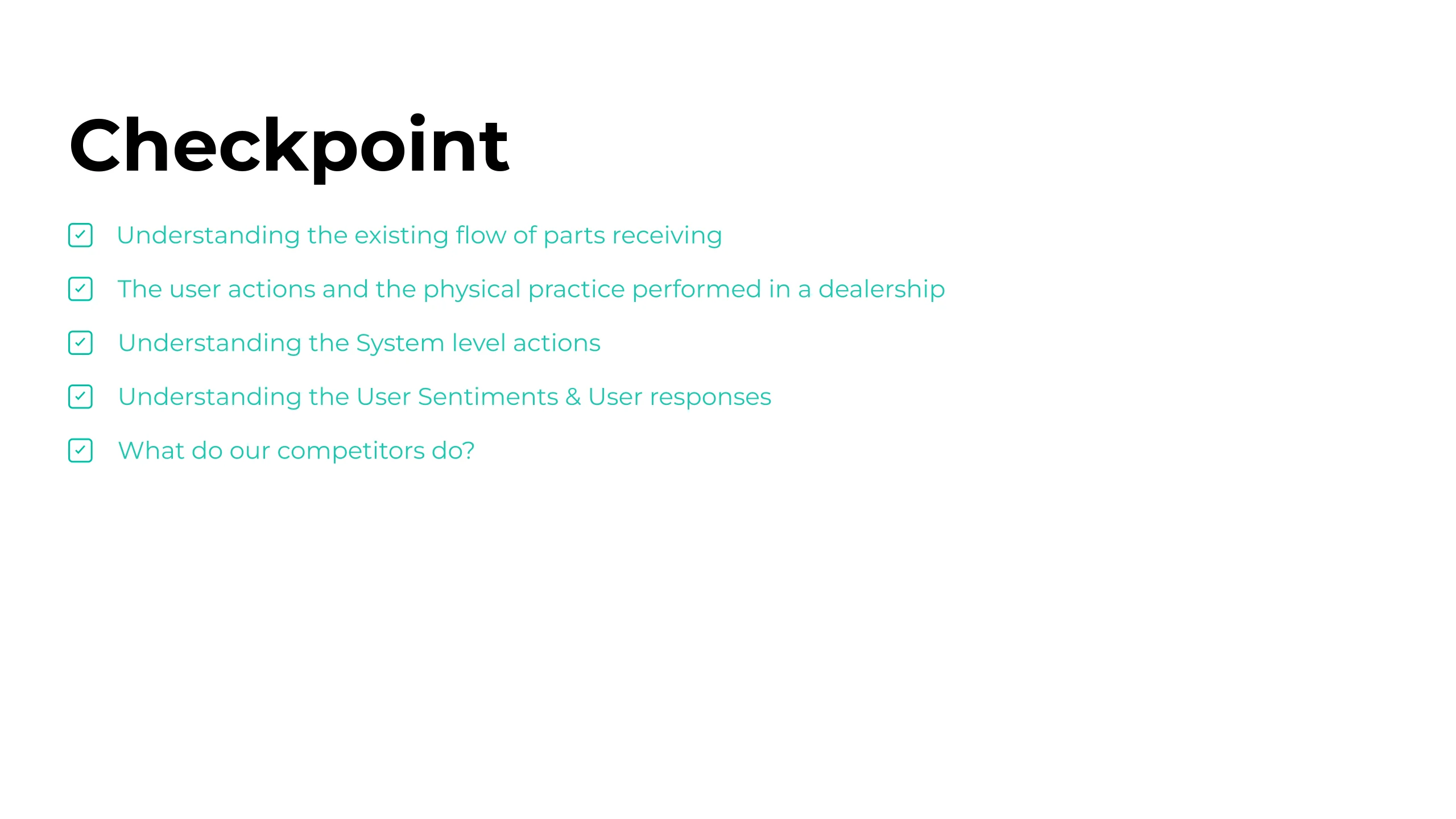
The last Discover checkpoint, every line now ticked: the existing receiving flow, the user actions and physical practice in a dealership, the system level actions, the user sentiments and responses, and what competitors do.

Define

03Objectives · 2 slides

~1 min

26
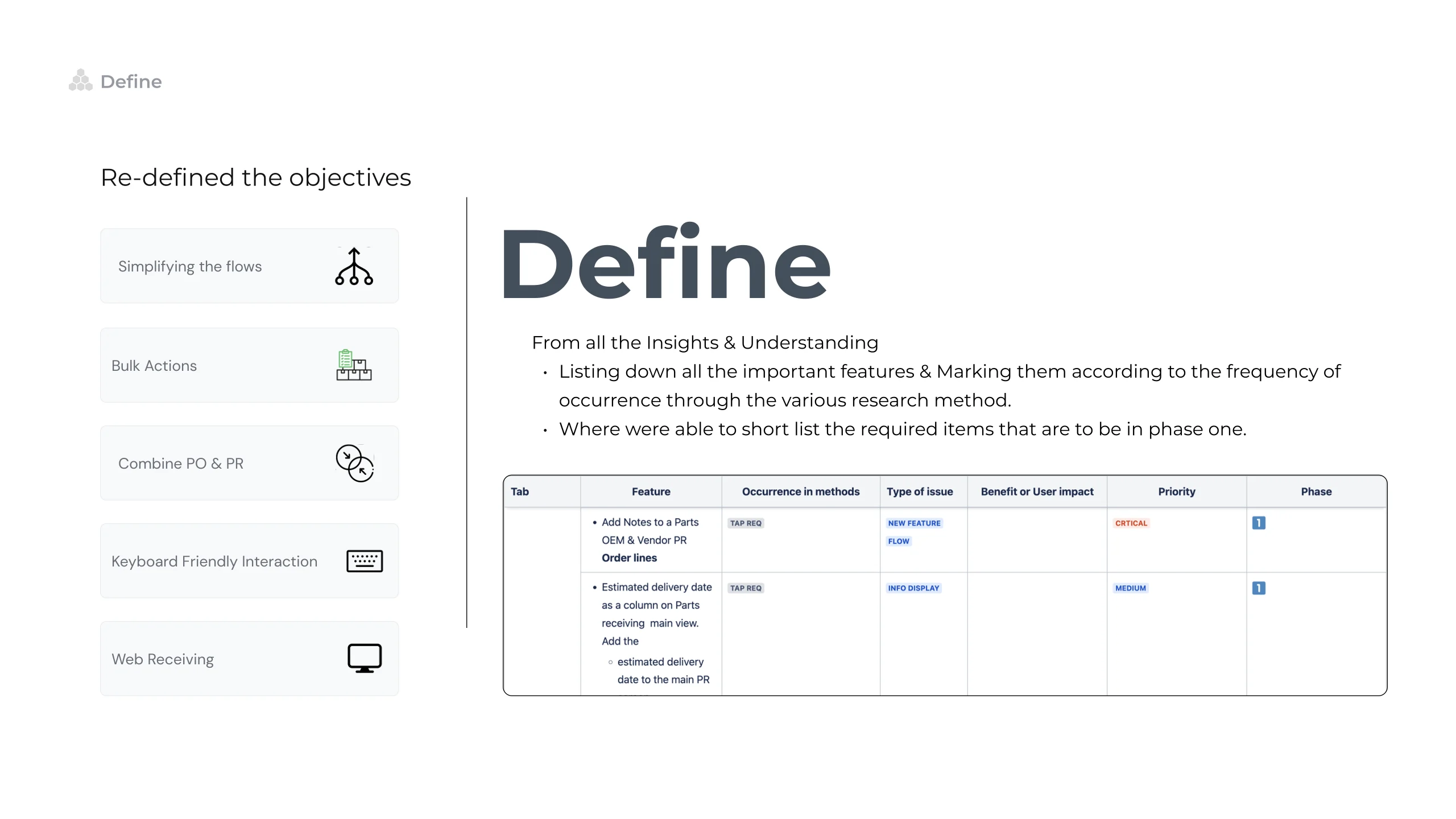
Define slide: the re defined objectives stacked down the left as labelled cards, simplifying the flows, bulk actions, combining purchase order with parts receiving, keyboard friendly interaction and web receiving, beside a table listing each feature against how often it recurred across the research methods, its type of issue, its benefit or user impact, its priority and its phase, used to short list what belonged in phase one.

27

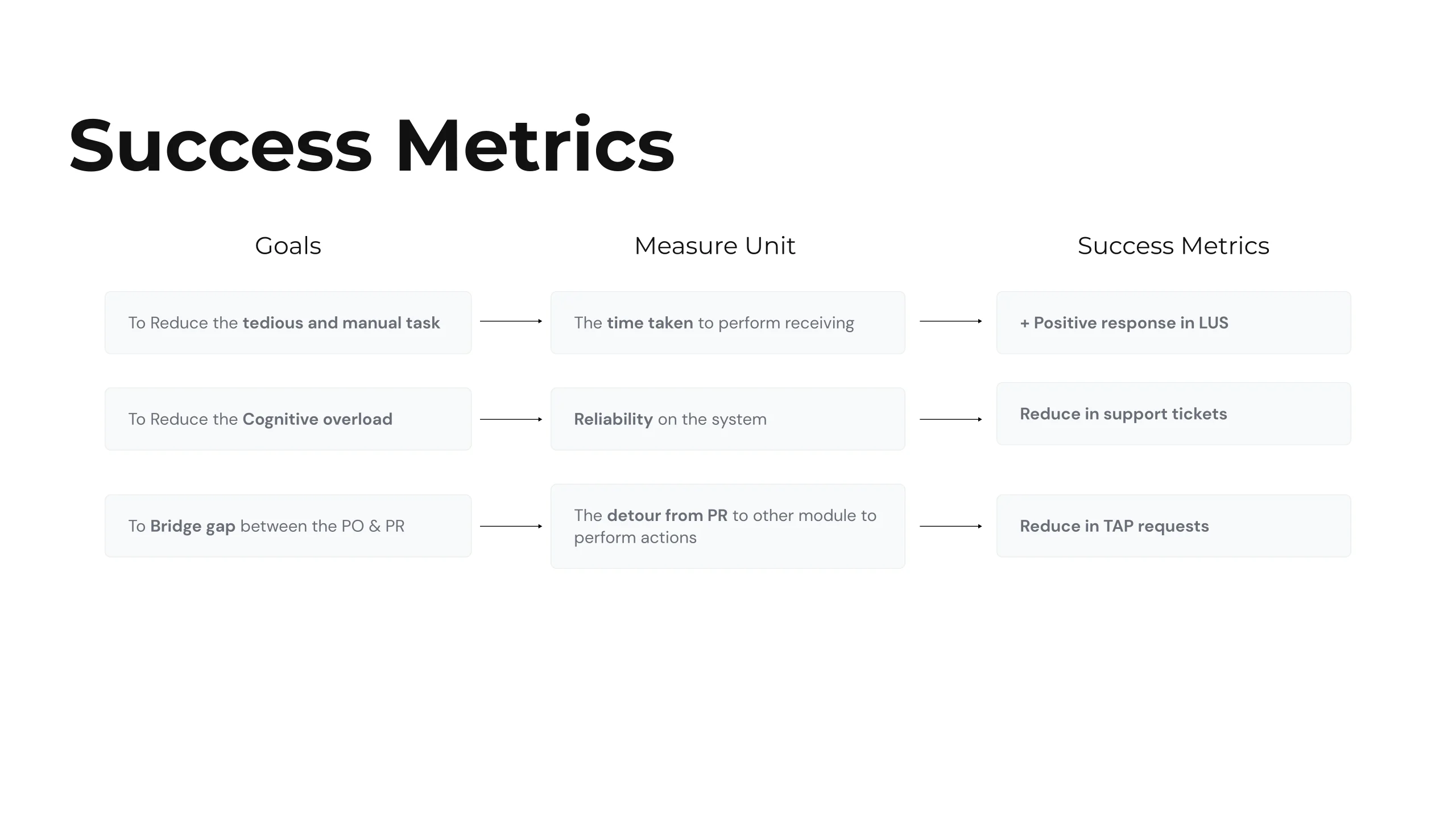
Success metrics slide: three goals arrowed across to their measure unit and then to their success metric. Reducing tedious manual work is measured by the time taken to perform receiving and read as positive response in live user sentiment; reducing cognitive overload is measured by reliability on the system and read as fewer support tickets; bridging the gap between purchase order and parts receiving is measured by the detour to another module and read as fewer TAP requests.

Design

04Ideation, screens · 6 slides

~6 min

28
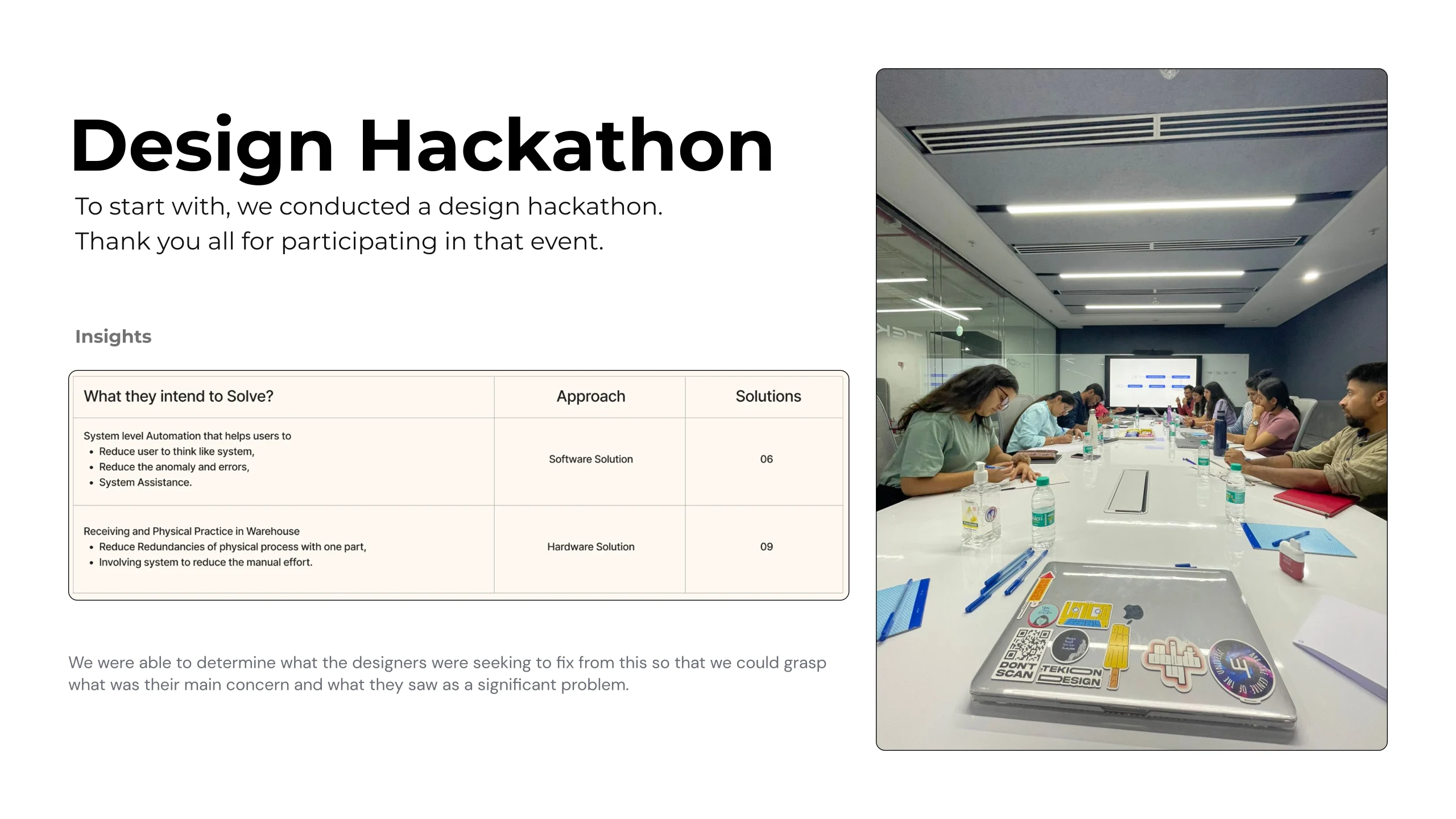
Design hackathon slide: a photograph of the session, a room of designers around a long table, beside a table of what they intended to solve with the approach and solution counts against each, run to open the ideation and to learn what the designers themselves saw as the significant problem.

29

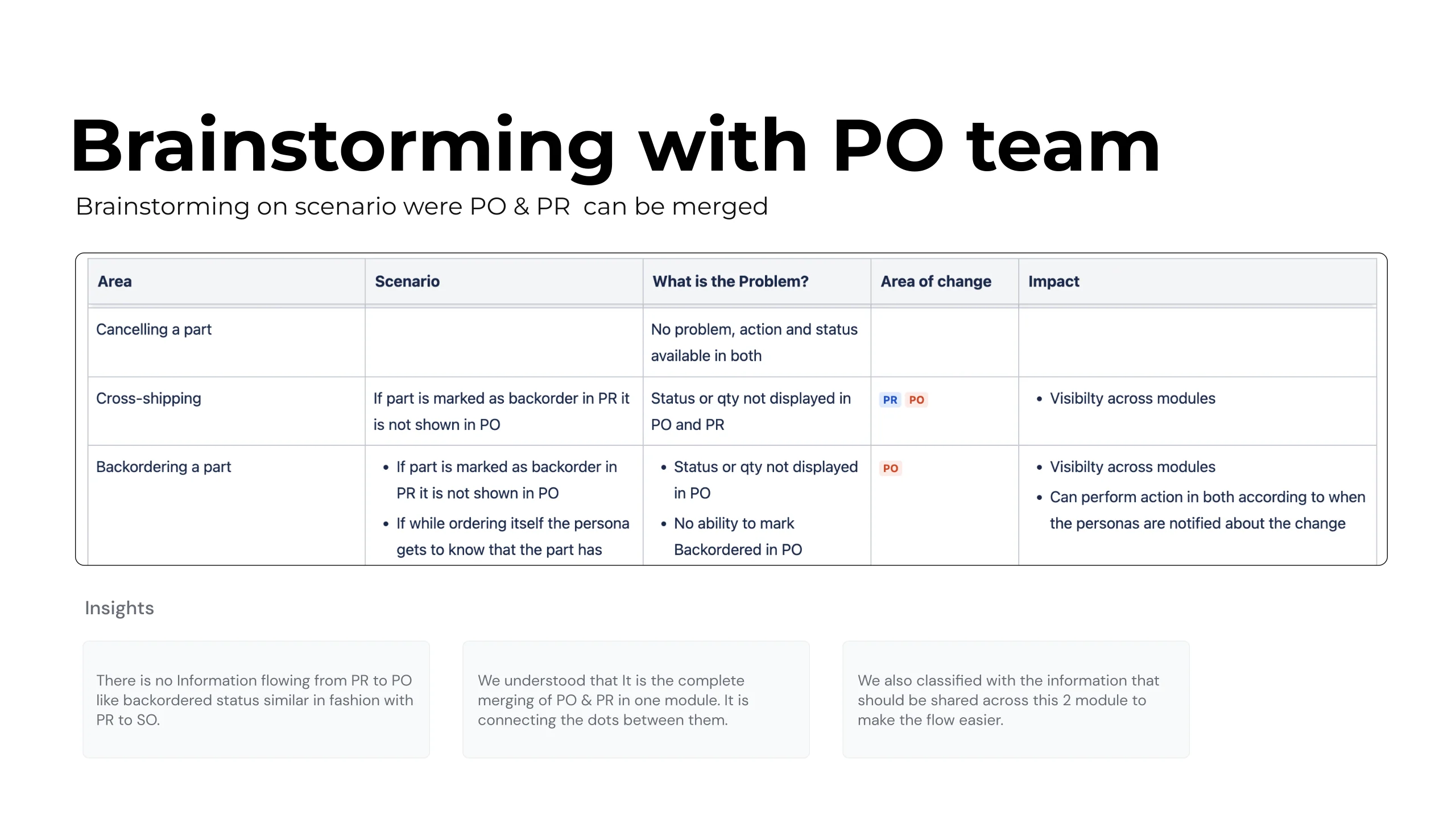
Brainstorming with the purchase order team on where purchase order and parts receiving could merge: a table walking three scenarios, cancelling a part, cross shipping and backordering a part, through the problem, the area of change and the impact, with three insight cards under it. The finding is that no information flows from receiving back to the order, so the answer is not merging two modules but classifying what information should be shared across both.

30

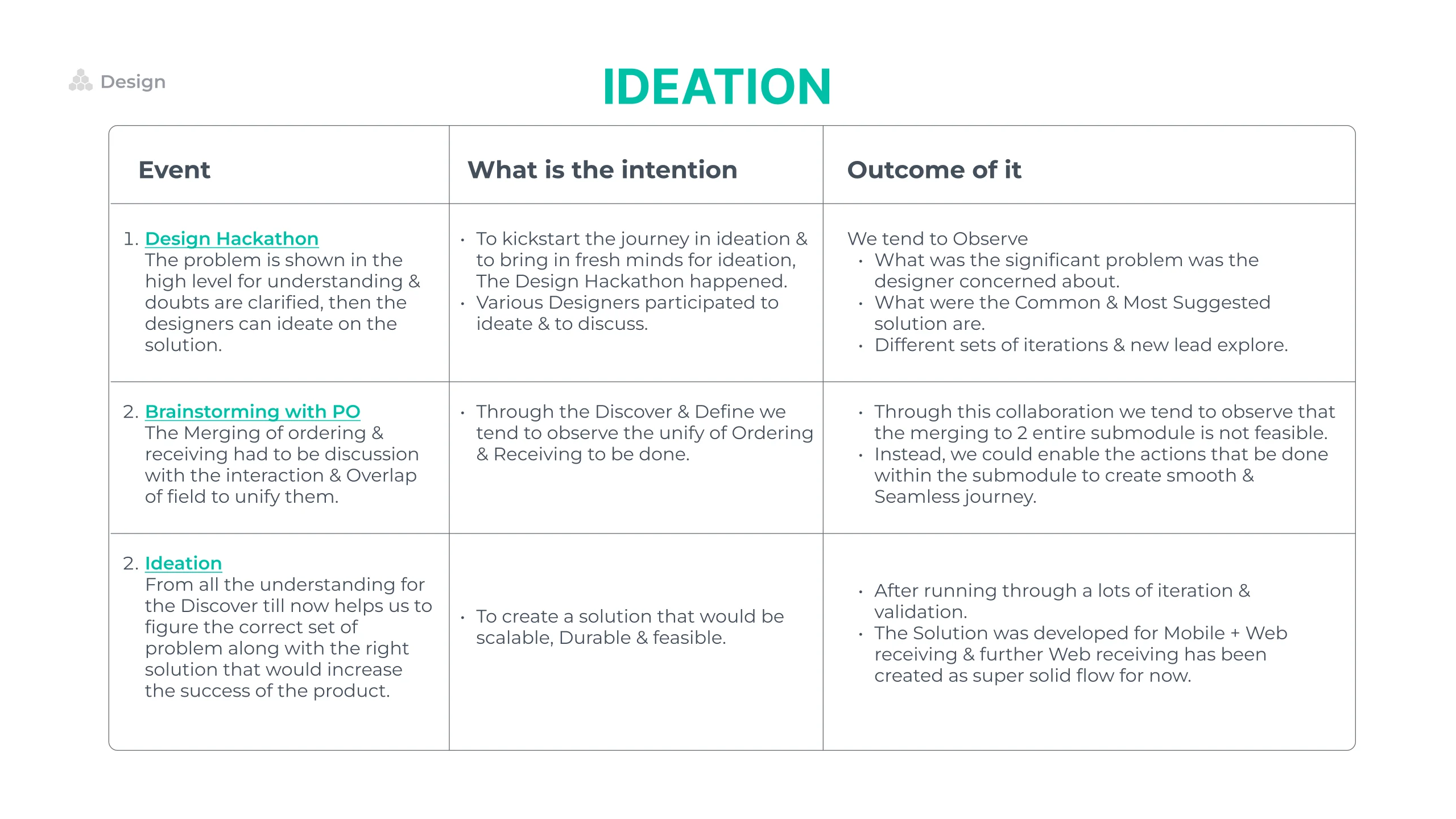
Ideation slide, a three row table of event, intention and outcome covering the design hackathon, the brainstorm with the purchase order team, and the ideation itself. The conclusion: merging two entire submodules is not feasible, so the actions are enabled inside the submodule to keep the journey seamless, aiming at a solution that is scalable, durable and feasible.

31

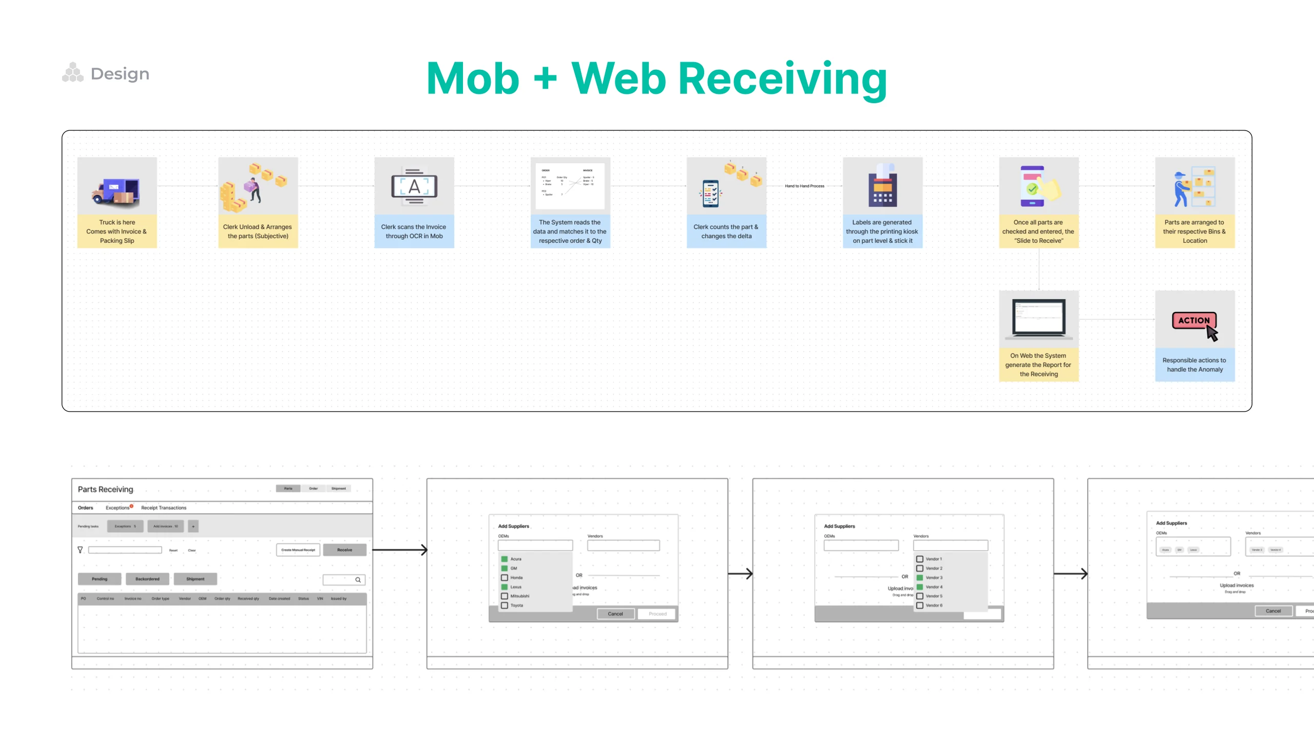
Mobile plus web receiving slide: a row of illustrated idea cards along the top, and beneath them a low fidelity flow strip carrying the receiving journey from screen to screen.

31 · The flow · Interactive

Scroll sideways

The low fidelity receiving flow, five wireframe screens left to right with arrows between them: the parts receiving orders list, then an Add Suppliers dialogue with a list of OEMs to tick, then the same dialogue with a vendor list open beside it, then the dialogue with the chosen OEMs and vendors entered as chips, and finally the add parts screen listing each part against received quantity, backordered, cancelled and anomaly.

32 · Interactive

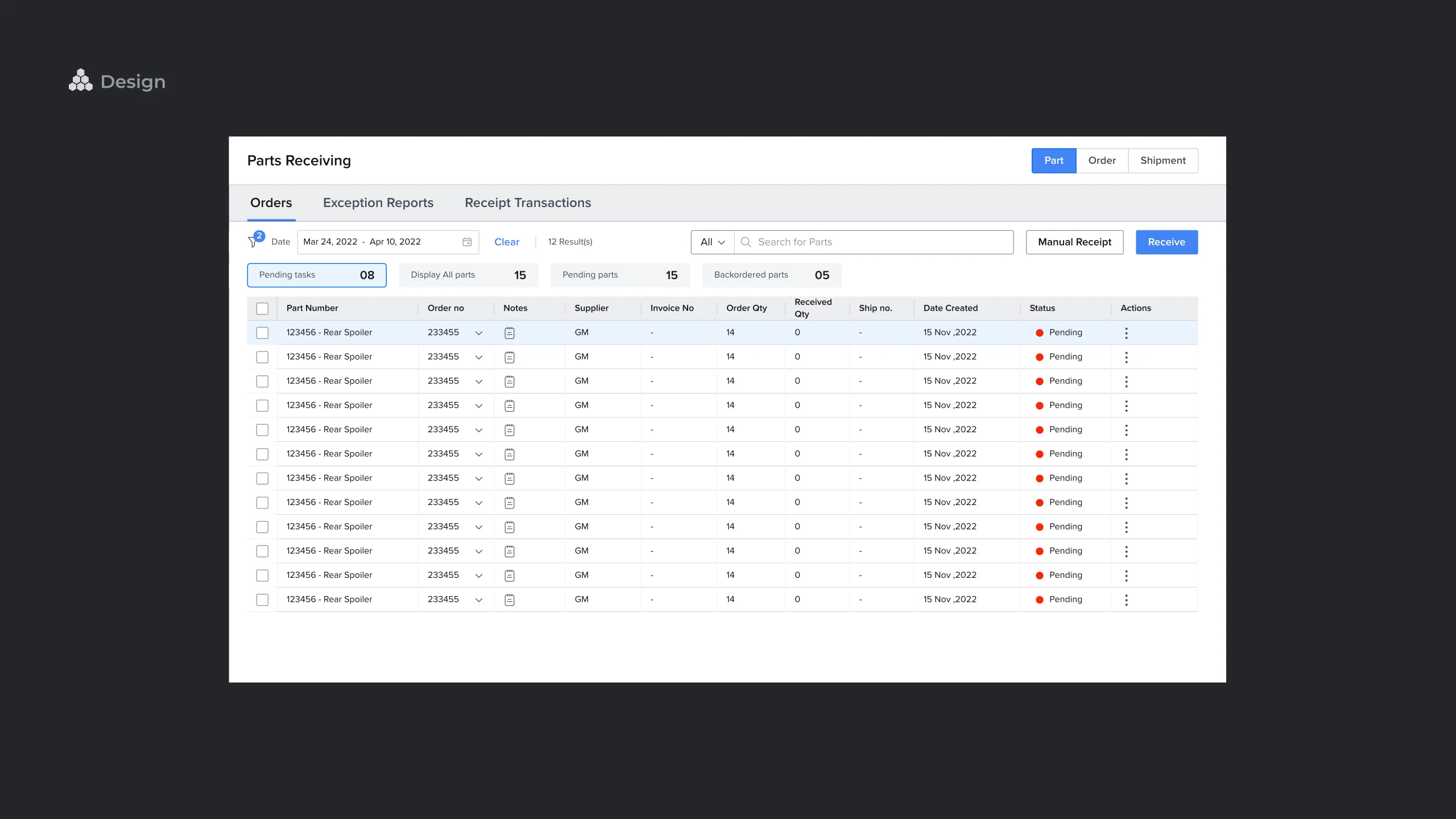
OCR concept, step one, on a dark ground: the parts receiving orders table with its pending tasks, orders not received, pending parts and backordered parts counters above it, and a Receive button top right. This is slide 32 as the deck prints it.

33

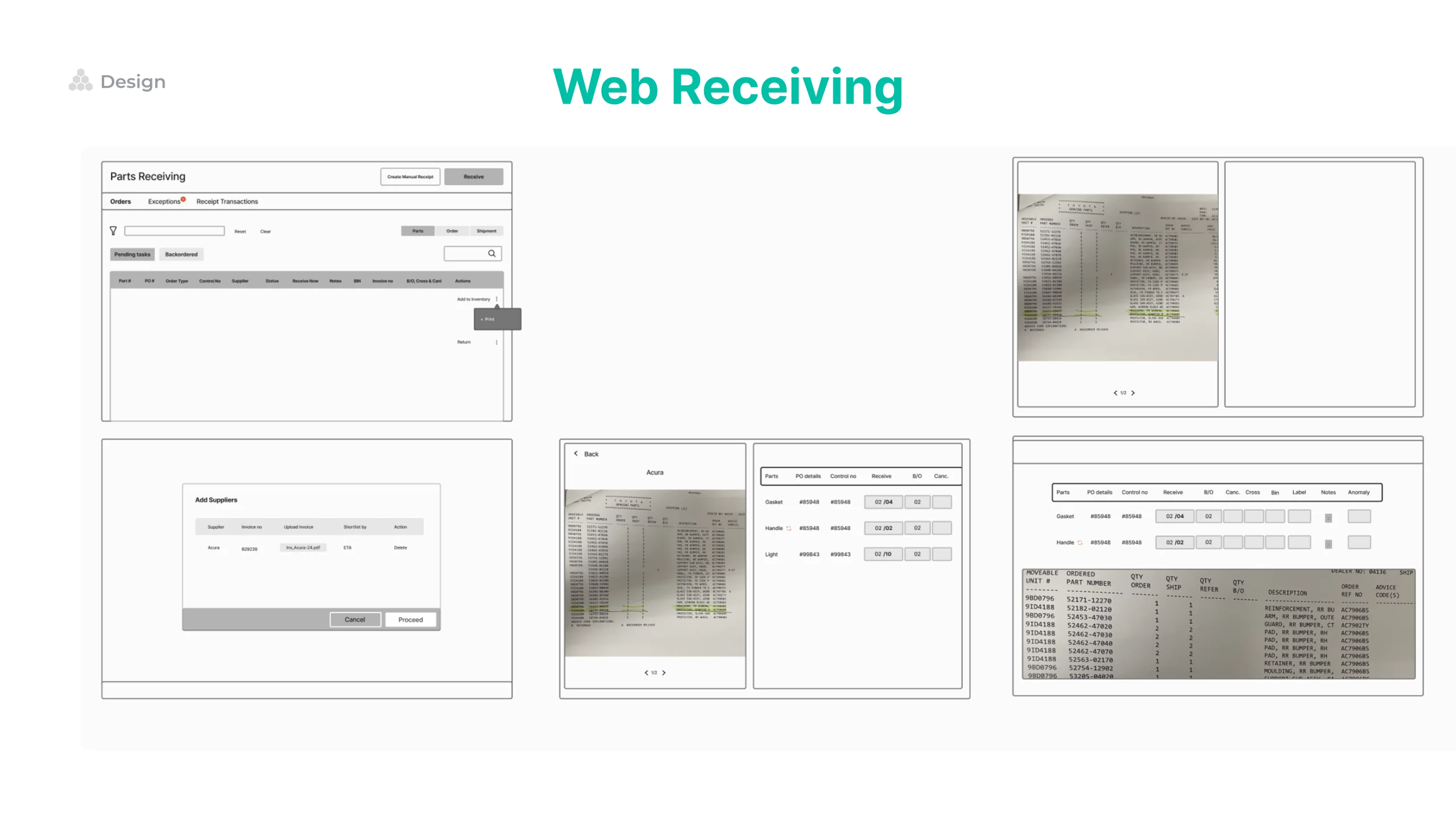
Web receiving slide: six wireframe screens laid out in a grid, working through the receiving flow from the orders list to the receipt detail.

33 · Web receiving · Interactive

Web receiving, screen one: the parts receiving orders list with Orders, Parts and Shipments across the top, counters for pending tasks, orders not received, backordered parts and cross shipped, and a table of purchase order number, order type, control number, supplier and status.

Deliver

05Handoff · 3 slides

~3 min

34Key screens · Interactive
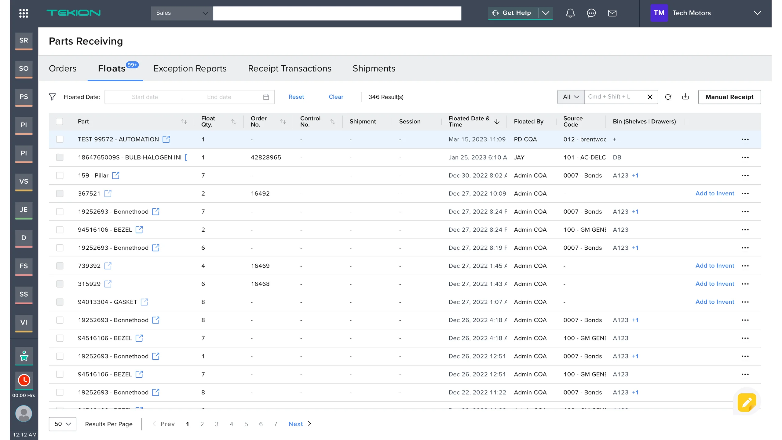
The existing parts receiving landing screen: a Floats tab carrying a 99 plus badge is selected among Orders, Floats, Exception Reports, Receipt Transactions and Shipments, above a floated date filter reading 346 results and a dense table of part, float quantity, order number, control number, shipment, session, floated date and time, floated by, source code and bin.
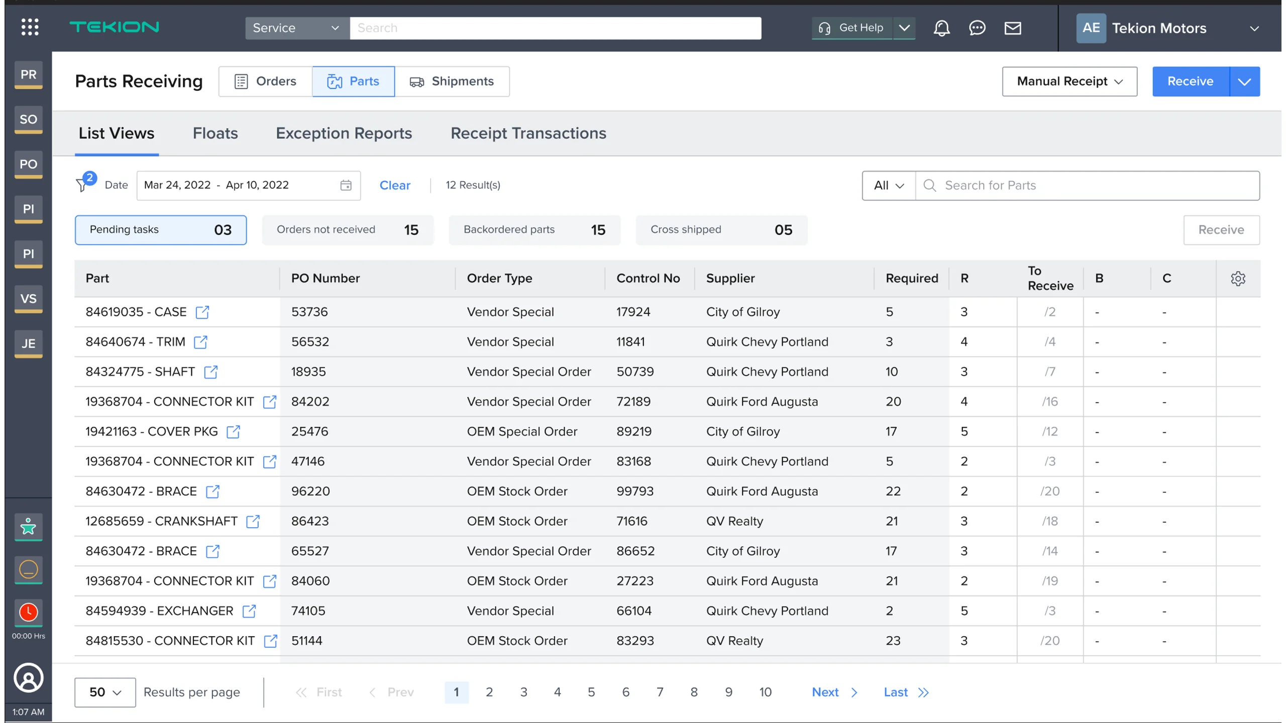
The new parts receiving landing screen: Orders, Parts and Shipments as three labelled buttons beside the page title, a Receive button top right, a row of counters reading pending tasks 03, orders not received 15, backordered parts 15 and cross shipped 05, and a table of part, purchase order number, order type, control number, supplier, required, received, to receive, backordered and cancelled.
NewExisting

Drag the handle to wipe between the existing landing screen and the new one.

34 · Product views · Interactive
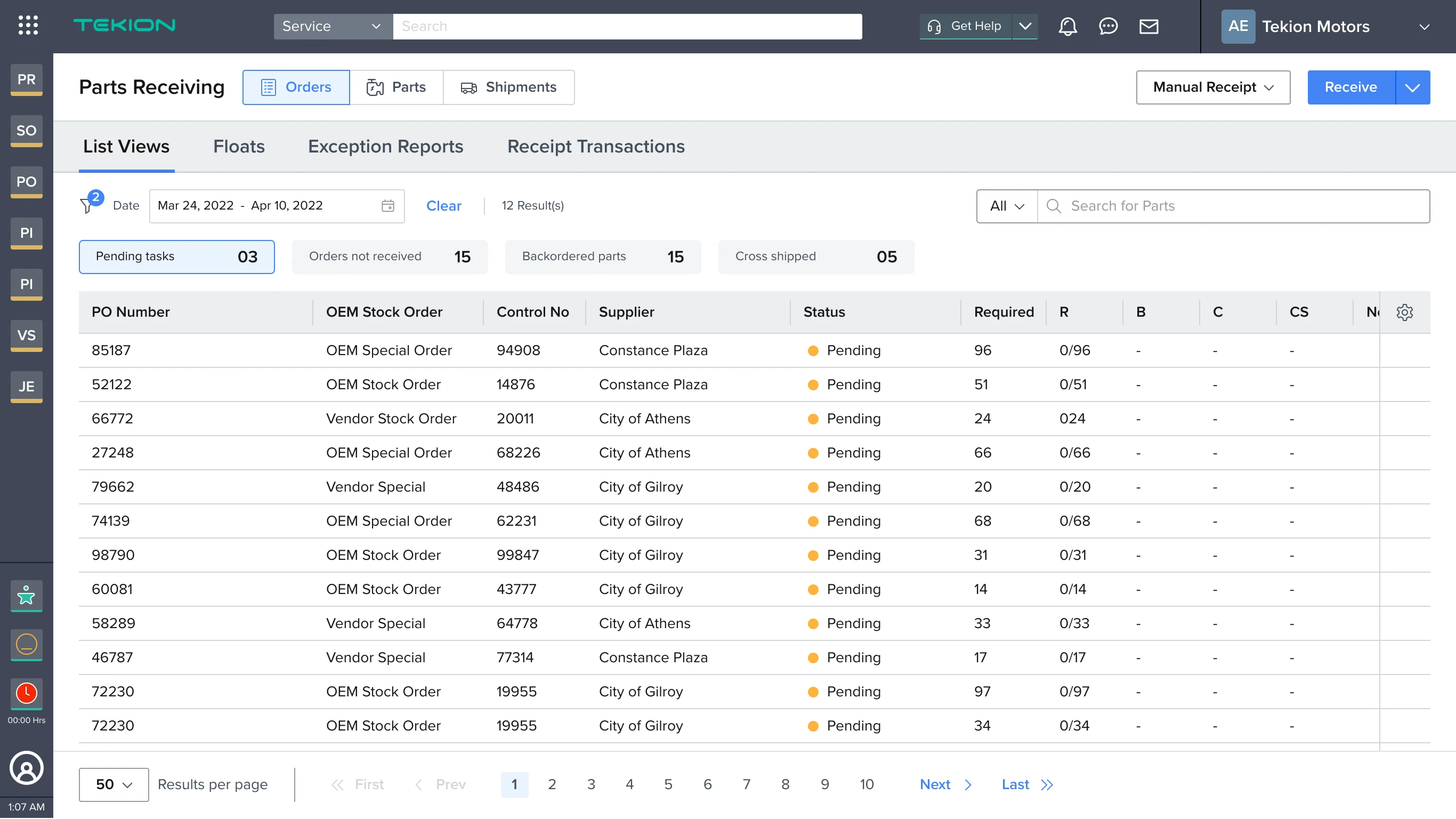
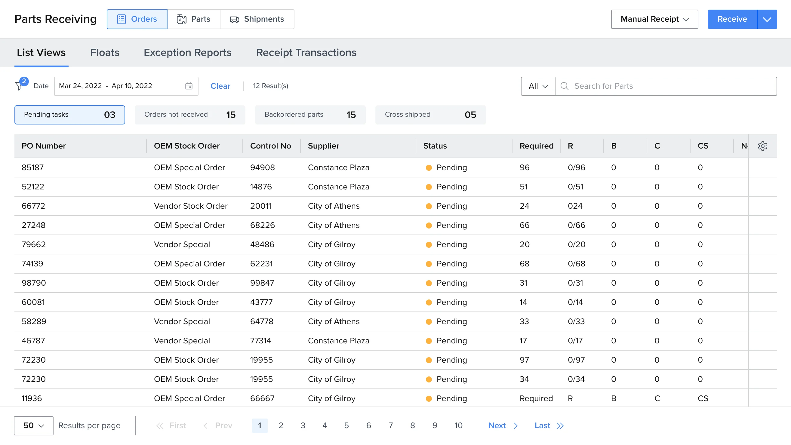
The purchase order view of the new parts receiving screen: Orders selected, a list of purchase orders by number, OEM or vendor stock order type, control number, supplier and status, each pending, with required and received counts against them.

Purchase order view

35

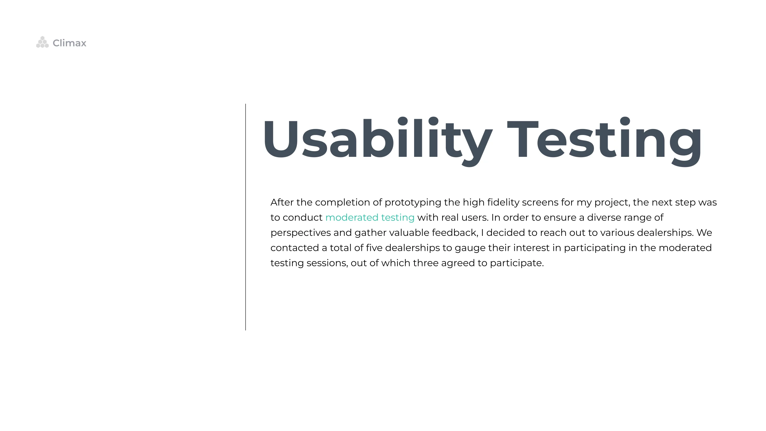
Usability Testing slide: after prototyping the high fidelity screens, moderated testing was run with real users. Five dealerships were contacted to gather a diverse range of perspectives, and three agreed to take part.

36

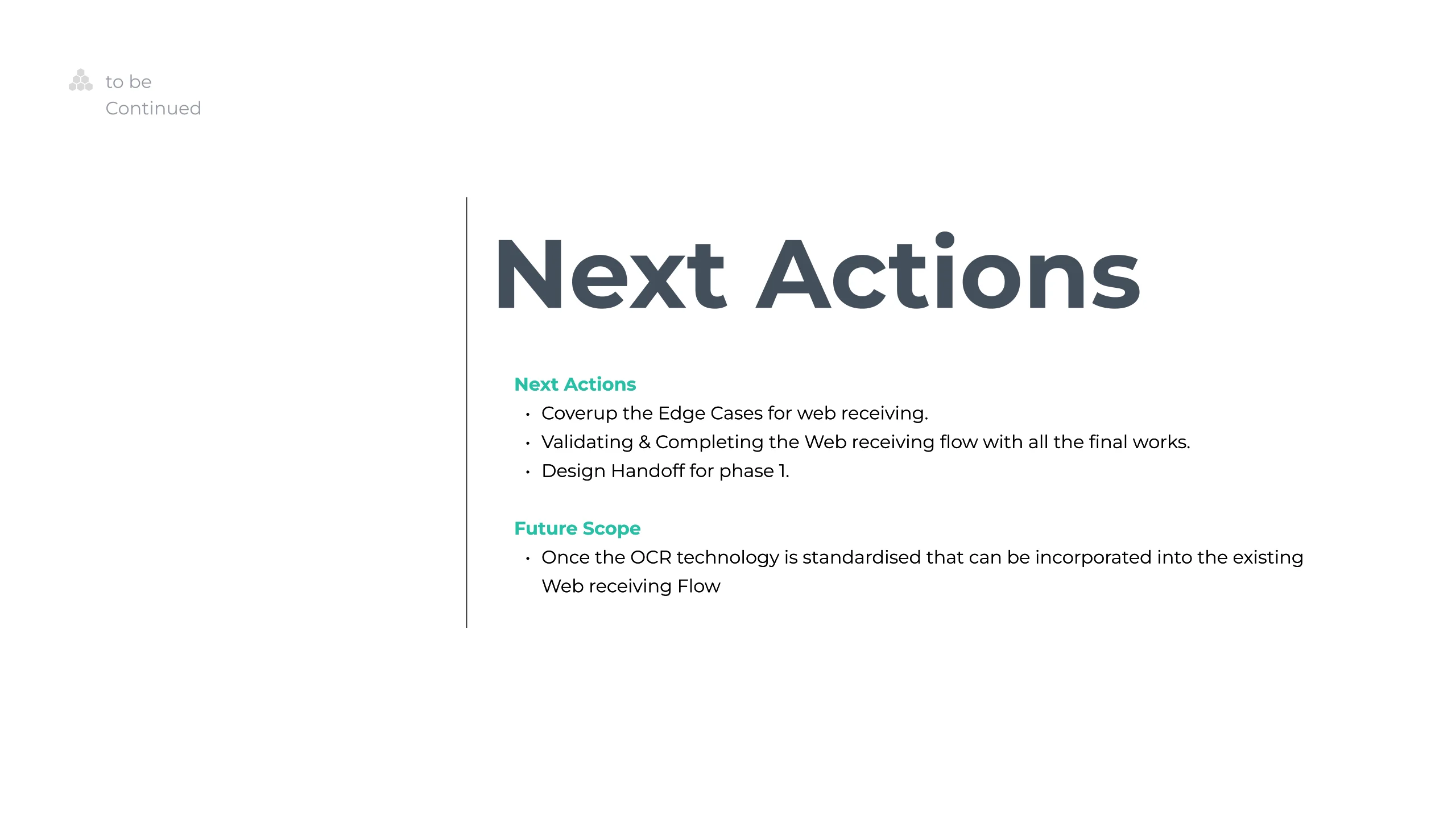
Next Actions slide: cover the edge cases for web receiving, validate and complete the web receiving flow, and hand off phase one to design. Under future scope, once optical character recognition is standardised it can be built into the existing web receiving flow.

What Else I do

Work with me

That is the Tekion half of it. The resume has the whole run on one page, and the story page has the person who did it.
Resume
My Story